

1.6 Plotting, Printing and Input Data
25
t = np.linspace(-2, 2, 100)
# choose 100 points in time interval
f_values = t**2
g_values = np.exp(t)
plt.plot(t, f_values, ’r’, t, g_values, ’b--’)
plt.xlabel(’t’)
plt.ylabel(’f and g’)
plt.legend([’t**2’, ’e**t’])
plt.title(’Plotting of two functions (t**2 and e**t)’)
plt.grid(’on’)
plt.axis([-3, 3, -1, 10])
plt.show()
In this code, you recognize the commands explained just above. Their impact on
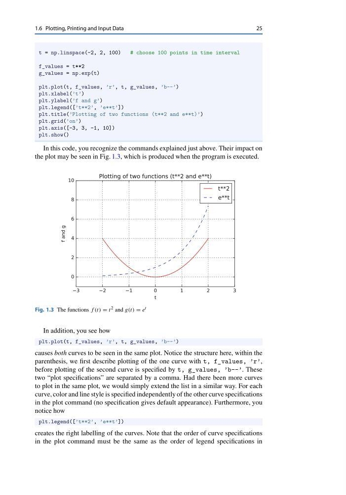
the plot may be seen in Fig. 1.3, which is produced when the program is executed.
Fig. 1.3 The functions f (t) = t 2 and g(t) = e t
In addition, you see how
plt.plot(t, f_values, ’r’, t, g_values, ’b--’)
causes both curves to be seen in the same plot. Notice the structure here, within the
parenthesis, we first describe plotting of the one curve with t, f_values, ’r’,
before plotting of the second curve is specified by t, g_values, ’b--’. These
two “plot specifications” are separated by a comma. Had there been more curves
to plot in the same plot, we would simply extend the list in a similar way. For each
curve, color and line style is specified independently of the other curve specifications
in the plot command (no specification gives default appearance). Furthermore, you
notice how
plt.legend([’t**2’, ’e**t’])
creates the right labelling of the curves. Note that the order of curve specifications
in the plot command must be the same as the order of legend specifications in
25
t = np.linspace(-2, 2, 100)
# choose 100 points in time interval
f_values = t**2
g_values = np.exp(t)
plt.plot(t, f_values, ’r’, t, g_values, ’b--’)
plt.xlabel(’t’)
plt.ylabel(’f and g’)
plt.legend([’t**2’, ’e**t’])
plt.title(’Plotting of two functions (t**2 and e**t)’)
plt.grid(’on’)
plt.axis([-3, 3, -1, 10])
plt.show()
In this code, you recognize the commands explained just above. Their impact on
the plot may be seen in Fig. 1.3, which is produced when the program is executed.
Fig. 1.3 The functions f (t) = t 2 and g(t) = e t
In addition, you see how
plt.plot(t, f_values, ’r’, t, g_values, ’b--’)
causes both curves to be seen in the same plot. Notice the structure here, within the
parenthesis, we first describe plotting of the one curve with t, f_values, ’r’,
before plotting of the second curve is specified by t, g_values, ’b--’. These
two “plot specifications” are separated by a comma. Had there been more curves
to plot in the same plot, we would simply extend the list in a similar way. For each
curve, color and line style is specified independently of the other curve specifications
in the plot command (no specification gives default appearance). Furthermore, you
notice how
plt.legend([’t**2’, ’e**t’])
creates the right labelling of the curves. Note that the order of curve specifications
in the plot command must be the same as the order of legend specifications in