

24
1 The First Few Steps
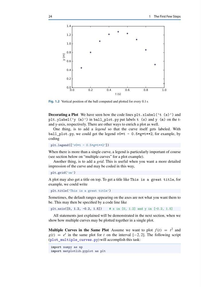
Fig. 1.2 Vertical position of the ball computed and plotted for every 0.1 s
Decorating a Plot We have seen how the code lines plt.xlabel(’t (s)’) and
plt.ylabel(’y (m)’) in ball_plot.py put labels t (s) and y (m) on the tand y-axis, respectively. There are other ways to enrich a plot as well.
One thing, is to add a legend so that the curve itself gets labeled. With
ball_plot.py, we could get the legend v0*t - 0.5*g*t**2, for example, by
coding
plt.legend([’v0*t - 0.5*g*t**2’])
When there is more than a single curve, a legend is particularly important of course
(see section below on “multiple curves” for a plot example).
Another thing, is to add a grid. This is useful when you want a more detailed
impression of the curve and may be coded in this way,
plt.grid(’on’)
A plot may also get a title on top. To get a title like This is a great title, for
example, we could write
plt.title(’This is a great title’)
Sometimes, the default ranges appearing on the axes are not what you want them to
be. This may then be specified by a code line like
plt.axis([0, 1.2, -0.2, 1.5])
# x in [0, 1.2] and y in [-0.2, 1.5]
All statements just explained will be demonstrated in the next section, when we
show how multiple curves may be plotted together in a single plot.
Multiple Curves in the Same Plot Assume we want to plot f (t) = t 2 and
g(t) = e t in the same plot for t on the interval [−2, 2]. The following script
(plot_multiple_curves.py) will accomplish this task:
import numpy as np
import matplotlib.pyplot as plt
1 The First Few Steps
Fig. 1.2 Vertical position of the ball computed and plotted for every 0.1 s
Decorating a Plot We have seen how the code lines plt.xlabel(’t (s)’) and
plt.ylabel(’y (m)’) in ball_plot.py put labels t (s) and y (m) on the tand y-axis, respectively. There are other ways to enrich a plot as well.
One thing, is to add a legend so that the curve itself gets labeled. With
ball_plot.py, we could get the legend v0*t - 0.5*g*t**2, for example, by
coding
plt.legend([’v0*t - 0.5*g*t**2’])
When there is more than a single curve, a legend is particularly important of course
(see section below on “multiple curves” for a plot example).
Another thing, is to add a grid. This is useful when you want a more detailed
impression of the curve and may be coded in this way,
plt.grid(’on’)
A plot may also get a title on top. To get a title like This is a great title, for
example, we could write
plt.title(’This is a great title’)
Sometimes, the default ranges appearing on the axes are not what you want them to
be. This may then be specified by a code line like
plt.axis([0, 1.2, -0.2, 1.5])
# x in [0, 1.2] and y in [-0.2, 1.5]
All statements just explained will be demonstrated in the next section, when we
show how multiple curves may be plotted together in a single plot.
Multiple Curves in the Same Plot Assume we want to plot f (t) = t 2 and
g(t) = e t in the same plot for t on the interval [−2, 2]. The following script
(plot_multiple_curves.py) will accomplish this task:
import numpy as np
import matplotlib.pyplot as plt