

relative error e. Usually, the accuracy of predictions can be improved with the use
of fresher data sets, but probably it does not work in the case of the UK statistics
due to its very irregular character. In particular, sometimes the official accumulated
number of cases (reported in [1]) decreases by a jump (see Fig. 6.20).
A comparison of the epidemic dynamics in the UK with the pandemic situation
in other countries and in the world is shown in Figs. 6.6 and 6.7. The SIR curves
and markers representing the V j values taken for calculations (“circles”), comparisons (“triangles”) and verifications of calculations (“stars”) are shown by red color
for the UK. It can be seen that the first cases in the UK probably occurred in the
beginning of January, 2020 (later than in USA, Italy, Germany and South Korea,
and approximately in the same time with Spain). But on May 13, 2020, the number
of cases registered in the UK was higher than in the EU countries (according to [1]).
6.9 USA
In this section, we consider the first wave of the COVID-19 epidemic in USA and
present the results of a SIR simulation.
The SIR simulation for the COVID-19 epidemic dynamics in USA was performed with the use of V j and t j data sets presented in Table 6.3 for period of time
T c from April 9 to April 29, 2020, taken for calculations. The results are shown in
Table 6.17 and Figs. 6.6, 6.7, 6.22 and 6.23; some of them were published in
[75, 77]. The value V f was interpolated using figures for accumulated number of
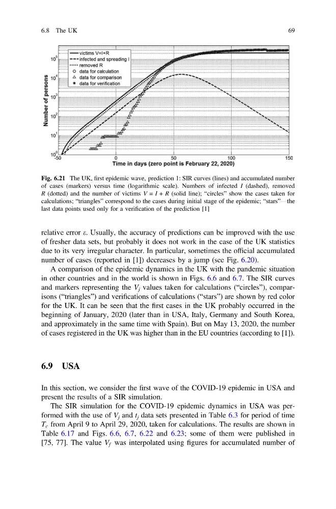
Fig. 6.21 The UK, first epidemic wave, prediction 1: SIR curves (lines) and accumulated number
of cases (markers) versus time (logarithmic scale). Numbers of infected I (dashed), removed
R (dotted) and the number of victims V = I + R (solid line); “circles” show the cases taken for
calculations; “triangles” correspond to the cases during initial stage of the epidemic; “stars”—the
last data points used only for a verification of the prediction [1]
6.8 The UK
69
of fresher data sets, but probably it does not work in the case of the UK statistics
due to its very irregular character. In particular, sometimes the official accumulated
number of cases (reported in [1]) decreases by a jump (see Fig. 6.20).
A comparison of the epidemic dynamics in the UK with the pandemic situation
in other countries and in the world is shown in Figs. 6.6 and 6.7. The SIR curves
and markers representing the V j values taken for calculations (“circles”), comparisons (“triangles”) and verifications of calculations (“stars”) are shown by red color
for the UK. It can be seen that the first cases in the UK probably occurred in the
beginning of January, 2020 (later than in USA, Italy, Germany and South Korea,
and approximately in the same time with Spain). But on May 13, 2020, the number
of cases registered in the UK was higher than in the EU countries (according to [1]).
6.9 USA
In this section, we consider the first wave of the COVID-19 epidemic in USA and
present the results of a SIR simulation.
The SIR simulation for the COVID-19 epidemic dynamics in USA was performed with the use of V j and t j data sets presented in Table 6.3 for period of time
T c from April 9 to April 29, 2020, taken for calculations. The results are shown in
Table 6.17 and Figs. 6.6, 6.7, 6.22 and 6.23; some of them were published in
[75, 77]. The value V f was interpolated using figures for accumulated number of
Fig. 6.21 The UK, first epidemic wave, prediction 1: SIR curves (lines) and accumulated number
of cases (markers) versus time (logarithmic scale). Numbers of infected I (dashed), removed
R (dotted) and the number of victims V = I + R (solid line); “circles” show the cases taken for
calculations; “triangles” correspond to the cases during initial stage of the epidemic; “stars”—the
last data points used only for a verification of the prediction [1]
6.8 The UK
69