

4.4 Anomalies Within a Day
Subsequently, data from each time series has been processed to identify if there are
particular periods, throughout a daily operation (in 24 h), when faulty data is more
likely to occur. For this reason, data has been rearranged and categorized as hourly
data, disregarding the dates. Such analysis is presented in Fig. 14 for flows and
Fig. 15 for energy use. Due to these figures being a similar analysis of time series, red
dots represent the same faulty data flags on current data validation by Company A
(Table 5).
In the case of flows, most of the flags are present during the peak consumption
hours. However, the faulty data detected does not correspond to high or low values
either but to intermediate ones. In the case of PS WPK (see Fig. 14a), there are
3 values constantly picked by the system as faulty data near 4,000, 3,390 and
2,800 m
3 /h. In the case of pumping station AVW (see Fig. 14b), there is a value
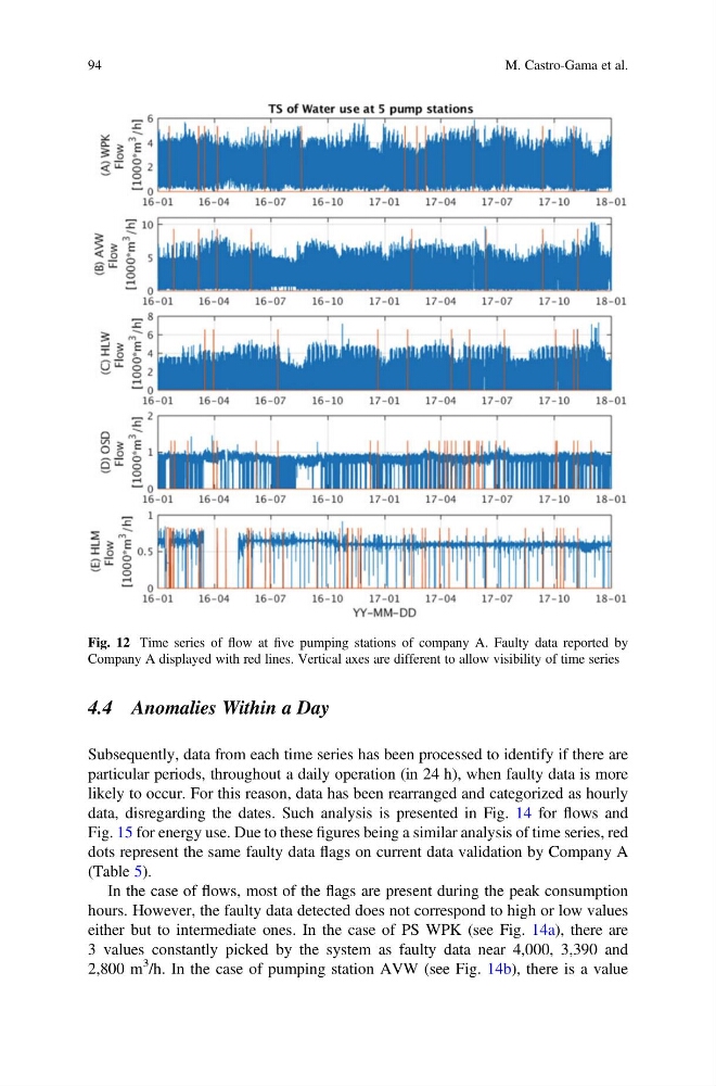
Fig. 12 Time series of flow at five pumping stations of company A. Faulty data reported by
Company A displayed with red lines. Vertical axes are different to allow visibility of time series
94
M. Castro-Gama et al.
Subsequently, data from each time series has been processed to identify if there are
particular periods, throughout a daily operation (in 24 h), when faulty data is more
likely to occur. For this reason, data has been rearranged and categorized as hourly
data, disregarding the dates. Such analysis is presented in Fig. 14 for flows and
Fig. 15 for energy use. Due to these figures being a similar analysis of time series, red
dots represent the same faulty data flags on current data validation by Company A
(Table 5).
In the case of flows, most of the flags are present during the peak consumption
hours. However, the faulty data detected does not correspond to high or low values
either but to intermediate ones. In the case of PS WPK (see Fig. 14a), there are
3 values constantly picked by the system as faulty data near 4,000, 3,390 and
2,800 m
3 /h. In the case of pumping station AVW (see Fig. 14b), there is a value
Fig. 12 Time series of flow at five pumping stations of company A. Faulty data reported by
Company A displayed with red lines. Vertical axes are different to allow visibility of time series
94
M. Castro-Gama et al.