

Presentation ofstatistical data 535
Class interval
(a)
(b)
Lower
class
boundary
Upper
class
boundary
Class
mid-point
7.35
to 7.3
7.4 to 7.6
7.7 to
7.65
7.5
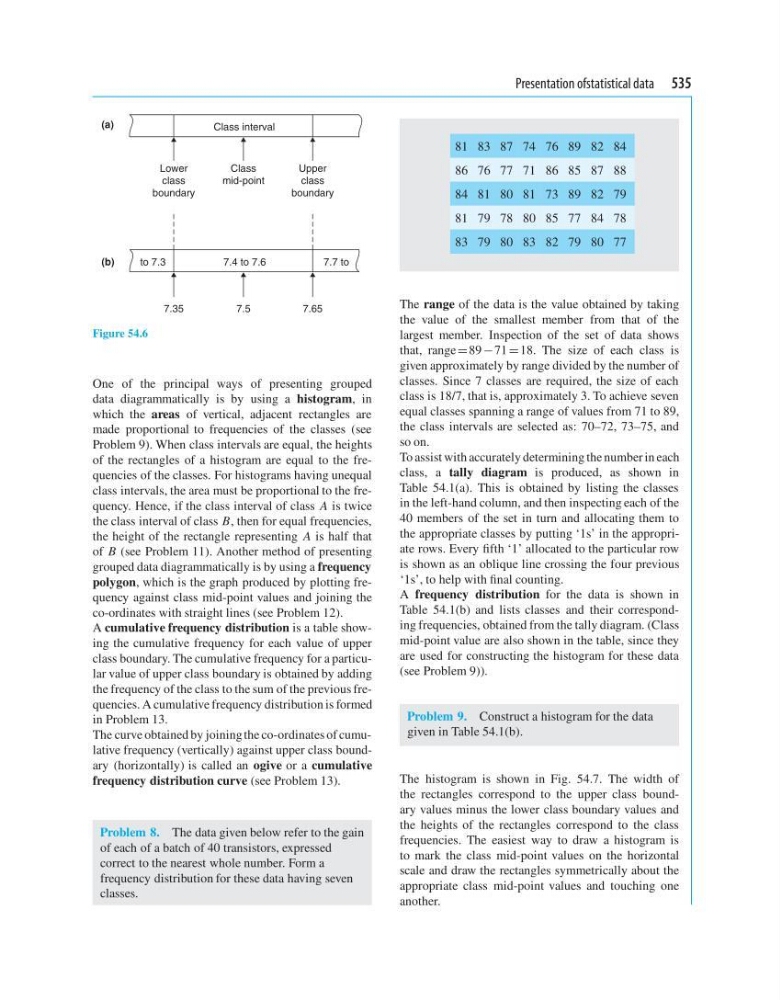
Figure 54.6
One of the principal ways of presenting grouped
data diagrammatically is by using a histogram, in
which the areas of vertical, adjacent rectangles are
made proportional to frequencies of the classes (see
Problem 9). When class intervals are equal, the heights
of the rectangles of a histogram are equal to the frequencies of the classes. For histograms having unequal
class intervals, the area must be proportional to the frequency. Hence, if the class interval of class A is twice
the class interval of class B, then for equal frequencies,
the height of the rectangle representing A is half that
of B (see Problem 11). Another method of presenting
grouped data diagrammatically is by using a frequency
polygon, which is the graph produced by plotting frequency against class mid-point values and joining the
co-ordinates with straight lines (see Problem 12).
A cumulative frequency distribution is a table showing the cumulative frequency for each value of upper
class boundary. The cumulative frequency for a particular value of upper class boundary is obtained by adding
the frequency of the class to the sum of the previous frequencies. A cumulative frequency distribution is formed
in Problem 13.
The curve obtained by joining the co-ordinates of cumulative frequency (vertically) against upper class boundary (horizontally) is called an ogive or a cumulative
frequency distribution curve (see Problem 13).
Problem 8. The data given below refer to the gain
of each of a batch of 40 transistors, expressed
correct to the nearest whole number. Form a
frequency distribution for these data having seven
classes.
81 83 87 74 76 89 82 84
86 76 77 71 86 85 87 88
84 81 80 81 73 89 82 79
81 79 78 80 85 77 84 78
83 79 80 83 82 79 80 77
The range of the data is the value obtained by taking
the value of the smallest member from that of the
largest member. Inspection of the set of data shows
that, range = 89 −71 = 18. The size of each class is
given approximately by range divided by the number of
classes. Since 7 classes are required, the size of each
class is 18/7, that is, approximately 3. To achieve seven
equal classes spanning a range of values from 71 to 89,
the class intervals are selected as: 70–72, 73–75, and
so on.
To assist with accurately determining the number in each
class, a tally diagram is produced, as shown in
Table 54.1(a). This is obtained by listing the classes
in the left-hand column, and then inspecting each of the
40 members of the set in turn and allocating them to
the appropriate classes by putting ‘1s’ in the appropriate rows. Every fifth ‘1’ allocated to the particular row
is shown as an oblique line crossing the four previous
‘1s’, to help with final counting.
A frequency distribution for the data is shown in
Table 54.1(b) and lists classes and their corresponding frequencies, obtained from the tally diagram. (Class
mid-point value are also shown in the table, since they
are used for constructing the histogram for these data
(see Problem 9)).
Problem 9. Construct a histogram for the data
given in Table 54.1(b).
The histogram is shown in Fig. 54.7. The width of
the rectangles correspond to the upper class boundary values minus the lower class boundary values and
the heights of the rectangles correspond to the class
frequencies. The easiest way to draw a histogram is
to mark the class mid-point values on the horizontal
scale and draw the rectangles symmetrically about the
appropriate class mid-point values and touching one
another.
Class interval
(a)
(b)
Lower
class
boundary
Upper
class
boundary
Class
mid-point
7.35
to 7.3
7.4 to 7.6
7.7 to
7.65
7.5
Figure 54.6
One of the principal ways of presenting grouped
data diagrammatically is by using a histogram, in
which the areas of vertical, adjacent rectangles are
made proportional to frequencies of the classes (see
Problem 9). When class intervals are equal, the heights
of the rectangles of a histogram are equal to the frequencies of the classes. For histograms having unequal
class intervals, the area must be proportional to the frequency. Hence, if the class interval of class A is twice
the class interval of class B, then for equal frequencies,
the height of the rectangle representing A is half that
of B (see Problem 11). Another method of presenting
grouped data diagrammatically is by using a frequency
polygon, which is the graph produced by plotting frequency against class mid-point values and joining the
co-ordinates with straight lines (see Problem 12).
A cumulative frequency distribution is a table showing the cumulative frequency for each value of upper
class boundary. The cumulative frequency for a particular value of upper class boundary is obtained by adding
the frequency of the class to the sum of the previous frequencies. A cumulative frequency distribution is formed
in Problem 13.
The curve obtained by joining the co-ordinates of cumulative frequency (vertically) against upper class boundary (horizontally) is called an ogive or a cumulative
frequency distribution curve (see Problem 13).
Problem 8. The data given below refer to the gain
of each of a batch of 40 transistors, expressed
correct to the nearest whole number. Form a
frequency distribution for these data having seven
classes.
81 83 87 74 76 89 82 84
86 76 77 71 86 85 87 88
84 81 80 81 73 89 82 79
81 79 78 80 85 77 84 78
83 79 80 83 82 79 80 77
The range of the data is the value obtained by taking
the value of the smallest member from that of the
largest member. Inspection of the set of data shows
that, range = 89 −71 = 18. The size of each class is
given approximately by range divided by the number of
classes. Since 7 classes are required, the size of each
class is 18/7, that is, approximately 3. To achieve seven
equal classes spanning a range of values from 71 to 89,
the class intervals are selected as: 70–72, 73–75, and
so on.
To assist with accurately determining the number in each
class, a tally diagram is produced, as shown in
Table 54.1(a). This is obtained by listing the classes
in the left-hand column, and then inspecting each of the
40 members of the set in turn and allocating them to
the appropriate classes by putting ‘1s’ in the appropriate rows. Every fifth ‘1’ allocated to the particular row
is shown as an oblique line crossing the four previous
‘1s’, to help with final counting.
A frequency distribution for the data is shown in
Table 54.1(b) and lists classes and their corresponding frequencies, obtained from the tally diagram. (Class
mid-point value are also shown in the table, since they
are used for constructing the histogram for these data
(see Problem 9)).
Problem 9. Construct a histogram for the data
given in Table 54.1(b).
The histogram is shown in Fig. 54.7. The width of
the rectangles correspond to the upper class boundary values minus the lower class boundary values and
the heights of the rectangles correspond to the class
frequencies. The easiest way to draw a histogram is
to mark the class mid-point values on the horizontal
scale and draw the rectangles symmetrically about the
appropriate class mid-point values and touching one
another.