

534 Higher Engineering Mathematics
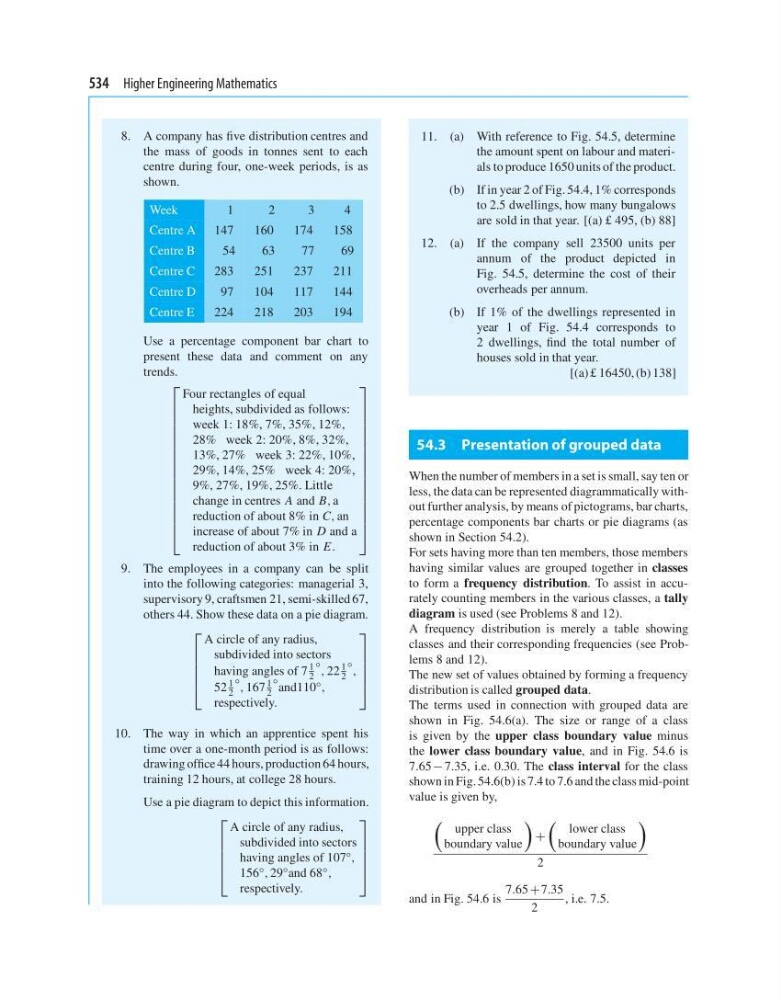
8. A company has five distribution centres and
the mass of goods in tonnes sent to each
centre during four, one-week periods, is as
shown.
Week
1
2
3
4
Centre A 147
160
174
158
Centre B
54
63
77
69
Centre C
283
251
237
211
Centre D
97
104
117
144
Centre E
224
218
203
194
Use a percentage component bar chart to
present these data and comment on any
trends.
⎡
⎢
⎢
⎢
⎢
⎢
⎢
⎢
⎢
⎢
⎢
⎢
⎢
⎢
⎢
⎢
⎢
⎣
Four rectangles of equal
heights, subdivided as follows:
week 1: 18%, 7%, 35%, 12%,
28% week 2: 20%, 8%, 32%,
13%, 27% week 3: 22%, 10%,
29%, 14%, 25% week 4: 20%,
9%, 27%, 19%, 25%. Little
change in centres A and B, a
reduction of about 8% in C, an
increase of about 7% in D and a
reduction of about 3% in E.
⎤
⎥
⎥
⎥
⎥
⎥
⎥
⎥
⎥
⎥
⎥
⎥
⎥
⎥
⎥
⎥
⎥
⎦
9. The employees in a company can be split
into the following categories: managerial 3,
supervisory 9, craftsmen 21, semi-skilled 67,
others 44. Show these data on a pie diagram.
⎡
⎢
⎢
⎢
⎢
⎣
A circle of any radius,
subdivided into sectors
having angles of 7
1
2
◦ , 22
1
2
◦ ,
52
1
2
◦ , 167
1
2
◦ and110 ◦ ,
respectively.
⎤
⎥
⎥
⎥
⎥
⎦
10. The way in which an apprentice spent his
time over a one-month period is as follows:
drawing office 44 hours, production 64 hours,
training 12 hours, at college 28 hours.
Use a pie diagram to depict this information.
⎡
⎢
⎢
⎢
⎢
⎣
A circle of any radius,
subdivided into sectors
having angles of 107 ◦ ,
156 ◦ , 29 ◦ and 68 ◦ ,
respectively.
⎤
⎥
⎥
⎥
⎥
⎦
11. (a) With reference to Fig. 54.5, determine
the amount spent on labour and materials to produce 1650 units of the product.
(b) If in year 2 of Fig. 54.4, 1% corresponds
to 2.5 dwellings, how many bungalows
are sold in that year. [(a) £ 495, (b) 88]
12. (a) If the company sell 23500 units per
annum of the product depicted in
Fig. 54.5, determine the cost of their
overheads per annum.
(b) If 1% of the dwellings represented in
year 1 of Fig. 54.4 corresponds to
2 dwellings, find the total number of
houses sold in that year.
[(a) £ 16450, (b) 138]
54.3 Presentation of grouped data
When the number of members in a set is small, say ten or
less, the data can be represented diagrammatically without further analysis, by means of pictograms, bar charts,
percentage components bar charts or pie diagrams (as
shown in Section 54.2).
For sets having more than ten members, those members
having similar values are grouped together in classes
to form a frequency distribution. To assist in accurately counting members in the various classes, a tally
diagram is used (see Problems 8 and 12).
A frequency distribution is merely a table showing
classes and their corresponding frequencies (see Problems 8 and 12).
The new set of values obtained by forming a frequency
distribution is called grouped data.
The terms used in connection with grouped data are
shown in Fig. 54.6(a). The size or range of a class
is given by the upper class boundary value minus
the lower class boundary value, and in Fig. 54.6 is
7.65 − 7.35, i.e. 0.30. The class interval for the class
shown in Fig. 54.6(b) is 7.4 to 7.6 and the class mid-point
value is given by,
upper class
boundary value
+
lower class
boundary value
2
and in Fig. 54.6 is
7.65 +7.35
2
, i.e. 7.5.
8. A company has five distribution centres and
the mass of goods in tonnes sent to each
centre during four, one-week periods, is as
shown.
Week
1
2
3
4
Centre A 147
160
174
158
Centre B
54
63
77
69
Centre C
283
251
237
211
Centre D
97
104
117
144
Centre E
224
218
203
194
Use a percentage component bar chart to
present these data and comment on any
trends.
⎡
⎢
⎢
⎢
⎢
⎢
⎢
⎢
⎢
⎢
⎢
⎢
⎢
⎢
⎢
⎢
⎢
⎣
Four rectangles of equal
heights, subdivided as follows:
week 1: 18%, 7%, 35%, 12%,
28% week 2: 20%, 8%, 32%,
13%, 27% week 3: 22%, 10%,
29%, 14%, 25% week 4: 20%,
9%, 27%, 19%, 25%. Little
change in centres A and B, a
reduction of about 8% in C, an
increase of about 7% in D and a
reduction of about 3% in E.
⎤
⎥
⎥
⎥
⎥
⎥
⎥
⎥
⎥
⎥
⎥
⎥
⎥
⎥
⎥
⎥
⎥
⎦
9. The employees in a company can be split
into the following categories: managerial 3,
supervisory 9, craftsmen 21, semi-skilled 67,
others 44. Show these data on a pie diagram.
⎡
⎢
⎢
⎢
⎢
⎣
A circle of any radius,
subdivided into sectors
having angles of 7
1
2
◦ , 22
1
2
◦ ,
52
1
2
◦ , 167
1
2
◦ and110 ◦ ,
respectively.
⎤
⎥
⎥
⎥
⎥
⎦
10. The way in which an apprentice spent his
time over a one-month period is as follows:
drawing office 44 hours, production 64 hours,
training 12 hours, at college 28 hours.
Use a pie diagram to depict this information.
⎡
⎢
⎢
⎢
⎢
⎣
A circle of any radius,
subdivided into sectors
having angles of 107 ◦ ,
156 ◦ , 29 ◦ and 68 ◦ ,
respectively.
⎤
⎥
⎥
⎥
⎥
⎦
11. (a) With reference to Fig. 54.5, determine
the amount spent on labour and materials to produce 1650 units of the product.
(b) If in year 2 of Fig. 54.4, 1% corresponds
to 2.5 dwellings, how many bungalows
are sold in that year. [(a) £ 495, (b) 88]
12. (a) If the company sell 23500 units per
annum of the product depicted in
Fig. 54.5, determine the cost of their
overheads per annum.
(b) If 1% of the dwellings represented in
year 1 of Fig. 54.4 corresponds to
2 dwellings, find the total number of
houses sold in that year.
[(a) £ 16450, (b) 138]
54.3 Presentation of grouped data
When the number of members in a set is small, say ten or
less, the data can be represented diagrammatically without further analysis, by means of pictograms, bar charts,
percentage components bar charts or pie diagrams (as
shown in Section 54.2).
For sets having more than ten members, those members
having similar values are grouped together in classes
to form a frequency distribution. To assist in accurately counting members in the various classes, a tally
diagram is used (see Problems 8 and 12).
A frequency distribution is merely a table showing
classes and their corresponding frequencies (see Problems 8 and 12).
The new set of values obtained by forming a frequency
distribution is called grouped data.
The terms used in connection with grouped data are
shown in Fig. 54.6(a). The size or range of a class
is given by the upper class boundary value minus
the lower class boundary value, and in Fig. 54.6 is
7.65 − 7.35, i.e. 0.30. The class interval for the class
shown in Fig. 54.6(b) is 7.4 to 7.6 and the class mid-point
value is given by,
upper class
boundary value
+
lower class
boundary value
2
and in Fig. 54.6 is
7.65 +7.35
2
, i.e. 7.5.