

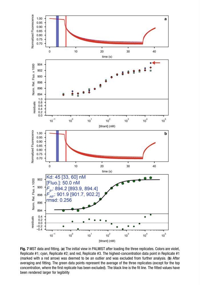
Fig. 7 MST data and fitting. (a) The initial view in PALMIST after loading the three replicates. Colors are violet,
Replicate #1; cyan, Replicate #2; and red, Replicate #3. The highest-concentration data point in Replicate #1
(marked with a red arrow) was deemed to be an outlier and was excluded from further analysis. (b) After
averaging and fitting. The green data points represent the average of the three replicates (except for the top
concentration, where the first replicate has been excluded). The black line is the fit line. The fitted values have
been rendered larger for legibility
Replicate #1; cyan, Replicate #2; and red, Replicate #3. The highest-concentration data point in Replicate #1
(marked with a red arrow) was deemed to be an outlier and was excluded from further analysis. (b) After
averaging and fitting. The green data points represent the average of the three replicates (except for the top
concentration, where the first replicate has been excluded). The black line is the fit line. The fitted values have
been rendered larger for legibility