

2. The electropherograms contain a lot of information besides the
visual part. In addition to the BI, it is worth to save additional
values such as peak intensities and positions, correction factors,
and baseline levels (see Note 6). This might help for further
analysis and can provide useful answers to several questions: for
instance, is the overexpressed domain stable and expressed
always at the same molecular weight?
3.5 Storing
and Plotting the Data
1. To combine all the data obtained with different plates, export
them into tables and create a repository data base, for instance
by using the SQLite3 Python engine. This type of interface
allows to “ask queries” and retrieves all the needed data from
this database at any moment for further comparisons and plots.
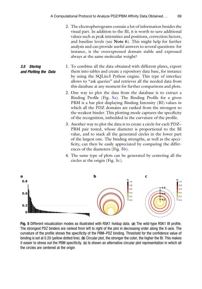
2. One way to plot the data from the database is to extract a
Binding Profile (Fig. 5a). The Binding Profile for a given
PBM is a bar plot displaying Binding Intensity (BI) values in
which all the PDZ domains are ranked from the strongest to
the weakest binder. This plotting mode captures the specificity
of the recognition, imbedded in the curvature of the profile.
3. Another way to plot the data is to create a circle for each PDZ–
PBM pair tested, whose diameter is proportional to the BI
value, and to stack all the generated circles in the lower part
of the largest one. The binding strengths, as well as the specificity, can then be easily appreciated by comparing the differences of the diameters (Fig. 5b).
4. The same type of plots can be generated by centering all the
circles at the origin (Fig. 5c).
Fig. 5 Different visualization modes as illustrated with RSK1 holdup data. (a) The wild-type RSK1 BI profile.
The strongest PDZ binders are ranked from left to right of the plot in decreasing order along the X-axis. The
curvature of the profile shows the specificity of the PBM–PDZ binding. Threshold for the confidence value of
binding is set at 0.20 (yellow dotted line). (b) Circular plot, the stronger the color, the higher the BI. This makes
it easier to stress out the PBM specificity. (c) Is shown an alternative circular plot representation in which all
the circles are centered at the origin
A Computational Protocol to Analyze PDZ/PBM Affinity Data Obtained. . .
69
visual part. In addition to the BI, it is worth to save additional
values such as peak intensities and positions, correction factors,
and baseline levels (see Note 6). This might help for further
analysis and can provide useful answers to several questions: for
instance, is the overexpressed domain stable and expressed
always at the same molecular weight?
3.5 Storing
and Plotting the Data
1. To combine all the data obtained with different plates, export
them into tables and create a repository data base, for instance
by using the SQLite3 Python engine. This type of interface
allows to “ask queries” and retrieves all the needed data from
this database at any moment for further comparisons and plots.
2. One way to plot the data from the database is to extract a
Binding Profile (Fig. 5a). The Binding Profile for a given
PBM is a bar plot displaying Binding Intensity (BI) values in
which all the PDZ domains are ranked from the strongest to
the weakest binder. This plotting mode captures the specificity
of the recognition, imbedded in the curvature of the profile.
3. Another way to plot the data is to create a circle for each PDZ–
PBM pair tested, whose diameter is proportional to the BI
value, and to stack all the generated circles in the lower part
of the largest one. The binding strengths, as well as the specificity, can then be easily appreciated by comparing the differences of the diameters (Fig. 5b).
4. The same type of plots can be generated by centering all the
circles at the origin (Fig. 5c).
Fig. 5 Different visualization modes as illustrated with RSK1 holdup data. (a) The wild-type RSK1 BI profile.
The strongest PDZ binders are ranked from left to right of the plot in decreasing order along the X-axis. The
curvature of the profile shows the specificity of the PBM–PDZ binding. Threshold for the confidence value of
binding is set at 0.20 (yellow dotted line). (b) Circular plot, the stronger the color, the higher the BI. This makes
it easier to stress out the PBM specificity. (c) Is shown an alternative circular plot representation in which all
the circles are centered at the origin
A Computational Protocol to Analyze PDZ/PBM Affinity Data Obtained. . .
69