

tions are so much smaller than that of carbon dioxide. The trace gases that are most important are
methane (CH 4 ), nitrous oxide (N 2 O), and chlorofluorocarbons (CFCs). These gases absorb wavelengths of
outgoing radiation from Earth that would otherwise
escape into space. Although individually their impact
is modest, taken together the effects of these trace
gases play a significant role in warming the
troposphere.
Methane is present in much smaller amounts
than CO 2 is, but its significance is greater than its
relatively small concentration would indicate
(FIGURE 20.28). The reason is that methane is about
20 times more effective than CO 2 at absorbing
infrared radiation emitted by Earth.
Methane is produced by anaerobic bacteria in wet places where
oxygen is scarce (anaerobic means “without air,” specifically oxygen). Such places include swamps, bogs, wetlands, and the guts of
termites and grazing animals like cattle and sheep. Methane is also
generated in flooded paddy fields (“artificial swamps”) used for
growing rice. Mining of coal and drilling for oil and natural gas are
other sources because methane is a product of the formation of
these fuels (FIGURE 20.29).
The concentration of methane in the atmosphere has risen rapidly since 1800, an increase that has been in step with the growth
CHAPTER 20 Global Climate Change
512
The world map in FIGURE 20.25B compares surface temperatures for
2009 to the base period (1951–1980). You can see that the
greatest warming has been in the Arctic and neighboring high latitude regions. Here are some related facts:
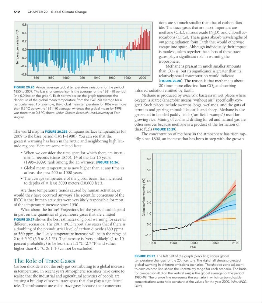
• When we consider the time span for which there are instrumental records (since 1850), 14 of the last 15 years
(1995–2009) rank among the 15 warmest (FIGURE 20.26).
• Global mean temperature is now higher than at any time in
at least the past 500 to 1000 years.
• The average temperature of the global ocean has increased
to depths of at least 3000 meters (10,000 feet).
Are these temperature trends caused by human activities, or
would they have occurred anyway? The scientific consensus of the
IPCC is that human activities were very likely responsible for most
of the temperature increase since 1950.
What about the future? Projections for the years ahead depend
in part on the quantities of greenhouse gases that are emitted.
FIGURE 20.27 shows the best estimates of global warming for several
different scenarios. The 2007 IPCC report also states that if there is
a doubling of the preindustrial level of carbon dioxide (280 ppm)
to 560 ppm, the “likely temperature increase will be in the range of
2 to 4.5 °C (3.5 to 8.1 °F). The increase is “very unlikely” (1 to 10
percent probability) to be less than 1.5 °C (2.7 °F) and values
higher than 4.5 °C (8.1 °F) cannot be excluded.
The Role of Trace Gases
Carbon dioxide is not the only gas contributing to a global increase
in temperature. In recent years atmospheric scientists have come to
realize that the industrial and agricultural activities of people are
causing a buildup of several trace gases that also play a significant
role. The substances are called trace gases because their concentraTemperature variation °C
1860
1880
1900
1920
1940
1960
1980
2000
–0.6
0.6
0.4
0.2
0.0
–0.2
–0.4
FIGURE 20.26 Annual average global temperature variations for the period
1850 to 2009. The basis for comparison is the average for the 1961–90 period
(the 0.0 line on the graph). Each narrow bar on the graph represents the
departure of the global mean temperature from the 1961–90 average for a
particular year. For example, the global mean temperature for 1862 was more
than 0.5 °C below the 1961–90 average, whereas the global mean for 1998
was more than 0.5 °C above. (After Climate Research Unit/University of East
Anglia)
Global surface warming (°C)
6.0
5.0
4.0
3.0
2.0
–1.0
0.0
1.0
1900
1950
2000
2050
2100
Year
FIGURE 20.27 The left half of the graph (black line) shows global
temperature changes for the 20th century. The right half shows projected
global warming in different emissions scenarios. The shaded zone adjacent
to each colored line shows the uncertainty range for each scenario. The basis
for comparison (0.0 on the vertical axis) is the global average for the period
1980–99. The orange line represents the scenario in which carbon dioxide
concentrations were held constant at the values for the year 2000. (After IPCC,
2007)
methane (CH 4 ), nitrous oxide (N 2 O), and chlorofluorocarbons (CFCs). These gases absorb wavelengths of
outgoing radiation from Earth that would otherwise
escape into space. Although individually their impact
is modest, taken together the effects of these trace
gases play a significant role in warming the
troposphere.
Methane is present in much smaller amounts
than CO 2 is, but its significance is greater than its
relatively small concentration would indicate
(FIGURE 20.28). The reason is that methane is about
20 times more effective than CO 2 at absorbing
infrared radiation emitted by Earth.
Methane is produced by anaerobic bacteria in wet places where
oxygen is scarce (anaerobic means “without air,” specifically oxygen). Such places include swamps, bogs, wetlands, and the guts of
termites and grazing animals like cattle and sheep. Methane is also
generated in flooded paddy fields (“artificial swamps”) used for
growing rice. Mining of coal and drilling for oil and natural gas are
other sources because methane is a product of the formation of
these fuels (FIGURE 20.29).
The concentration of methane in the atmosphere has risen rapidly since 1800, an increase that has been in step with the growth
CHAPTER 20 Global Climate Change
512
The world map in FIGURE 20.25B compares surface temperatures for
2009 to the base period (1951–1980). You can see that the
greatest warming has been in the Arctic and neighboring high latitude regions. Here are some related facts:
• When we consider the time span for which there are instrumental records (since 1850), 14 of the last 15 years
(1995–2009) rank among the 15 warmest (FIGURE 20.26).
• Global mean temperature is now higher than at any time in
at least the past 500 to 1000 years.
• The average temperature of the global ocean has increased
to depths of at least 3000 meters (10,000 feet).
Are these temperature trends caused by human activities, or
would they have occurred anyway? The scientific consensus of the
IPCC is that human activities were very likely responsible for most
of the temperature increase since 1950.
What about the future? Projections for the years ahead depend
in part on the quantities of greenhouse gases that are emitted.
FIGURE 20.27 shows the best estimates of global warming for several
different scenarios. The 2007 IPCC report also states that if there is
a doubling of the preindustrial level of carbon dioxide (280 ppm)
to 560 ppm, the “likely temperature increase will be in the range of
2 to 4.5 °C (3.5 to 8.1 °F). The increase is “very unlikely” (1 to 10
percent probability) to be less than 1.5 °C (2.7 °F) and values
higher than 4.5 °C (8.1 °F) cannot be excluded.
The Role of Trace Gases
Carbon dioxide is not the only gas contributing to a global increase
in temperature. In recent years atmospheric scientists have come to
realize that the industrial and agricultural activities of people are
causing a buildup of several trace gases that also play a significant
role. The substances are called trace gases because their concentraTemperature variation °C
1860
1880
1900
1920
1940
1960
1980
2000
–0.6
0.6
0.4
0.2
0.0
–0.2
–0.4
FIGURE 20.26 Annual average global temperature variations for the period
1850 to 2009. The basis for comparison is the average for the 1961–90 period
(the 0.0 line on the graph). Each narrow bar on the graph represents the
departure of the global mean temperature from the 1961–90 average for a
particular year. For example, the global mean temperature for 1862 was more
than 0.5 °C below the 1961–90 average, whereas the global mean for 1998
was more than 0.5 °C above. (After Climate Research Unit/University of East
Anglia)
Global surface warming (°C)
6.0
5.0
4.0
3.0
2.0
–1.0
0.0
1.0
1900
1950
2000
2050
2100
Year
FIGURE 20.27 The left half of the graph (black line) shows global
temperature changes for the 20th century. The right half shows projected
global warming in different emissions scenarios. The shaded zone adjacent
to each colored line shows the uncertainty range for each scenario. The basis
for comparison (0.0 on the vertical axis) is the global average for the period
1980–99. The orange line represents the scenario in which carbon dioxide
concentrations were held constant at the values for the year 2000. (After IPCC,
2007)