

410
Chapter 14 See the World in 3D
How Are 3D Maps Made?
A 3D-style map can be made by applying the previously described 3D modeling concepts. However, this time you’re not working with extruding polygons
representing building footprints, but instead you’re working with the shapes
and objects on a map. A regular choropleth or thematic map (see Chapter 7)
can be transformed into a 3D-style map by extruding the polygons displayed
on the map. The resulting extruded map is referred to as a prism map, while
the extruded shapes are called raised prisms. In a prism map, the shapes on
the map are extruded to a relative height that reflects the data value assigned
to them. For instance, if a thematic map of the United States showed population by state, then each state’s shape would be extruded to a “height” of the
number of units equal to that state’s population. Thus, the polygon shape of
California would be a raised prism extruded to a value of 36.7 million, while
neighboring Nevada’s shape would be extruded to a value of 2.6 million.
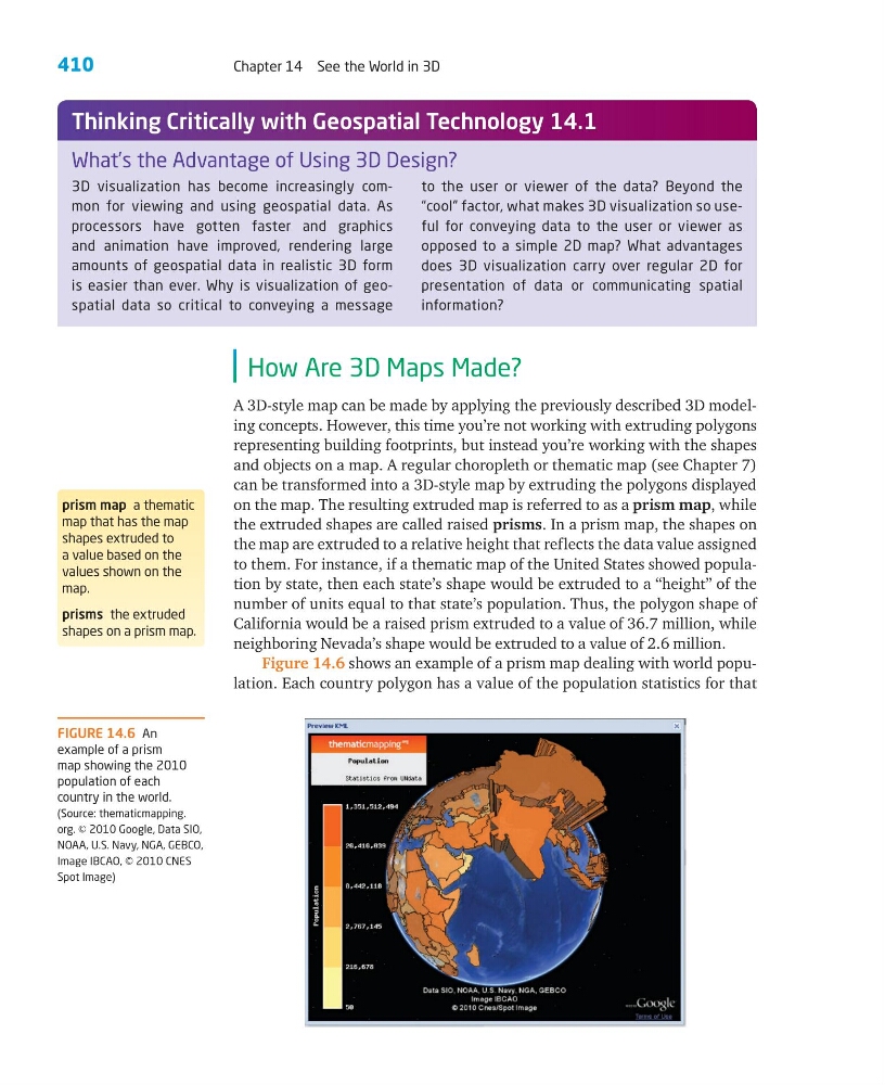
Figure 14.6 shows an example of a prism map dealing with world population. Each country polygon has a value of the population statistics for that
prism map a thematic
map that has the map
shapes extruded to
a value based on the
values shown on the
map.
prisms the extruded
shapes on a prism map.
3D visualization has become increasingly common for viewing and using geospatial data. As
processors have gotten faster and graphics
and animation have improved, rendering large
amounts of geospatial data in realistic 3D form
is easier than ever. Why is visualization of geospatial data so critical to conveying a message
to the user or viewer of the data? Beyond the
“cool” factor, what makes 3D visualization so useful for conveying data to the user or viewer as
opposed to a simple 2D map? What advantages
does 3D visualization carry over regular 2D for
presentation of data or communicating spatial
information?
What’s the Advantage of Using 3D Design?
Thinking Critically with Geospatial Technology 14.1
FIGURE 14.6 An
example of a prism
map showing the 2010
population of each
country in the world.
(Source: thematicmapping.
org. © 2010 Google, Data SIO,
NOAA, U.S. Navy, NGA, GEBCO,
Image IBCAO, © 2010 CNES
Spot Image)
Chapter 14 See the World in 3D
How Are 3D Maps Made?
A 3D-style map can be made by applying the previously described 3D modeling concepts. However, this time you’re not working with extruding polygons
representing building footprints, but instead you’re working with the shapes
and objects on a map. A regular choropleth or thematic map (see Chapter 7)
can be transformed into a 3D-style map by extruding the polygons displayed
on the map. The resulting extruded map is referred to as a prism map, while
the extruded shapes are called raised prisms. In a prism map, the shapes on
the map are extruded to a relative height that reflects the data value assigned
to them. For instance, if a thematic map of the United States showed population by state, then each state’s shape would be extruded to a “height” of the
number of units equal to that state’s population. Thus, the polygon shape of
California would be a raised prism extruded to a value of 36.7 million, while
neighboring Nevada’s shape would be extruded to a value of 2.6 million.
Figure 14.6 shows an example of a prism map dealing with world population. Each country polygon has a value of the population statistics for that
prism map a thematic
map that has the map
shapes extruded to
a value based on the
values shown on the
map.
prisms the extruded
shapes on a prism map.
3D visualization has become increasingly common for viewing and using geospatial data. As
processors have gotten faster and graphics
and animation have improved, rendering large
amounts of geospatial data in realistic 3D form
is easier than ever. Why is visualization of geospatial data so critical to conveying a message
to the user or viewer of the data? Beyond the
“cool” factor, what makes 3D visualization so useful for conveying data to the user or viewer as
opposed to a simple 2D map? What advantages
does 3D visualization carry over regular 2D for
presentation of data or communicating spatial
information?
What’s the Advantage of Using 3D Design?
Thinking Critically with Geospatial Technology 14.1
FIGURE 14.6 An
example of a prism
map showing the 2010
population of each
country in the world.
(Source: thematicmapping.
org. © 2010 Google, Data SIO,
NOAA, U.S. Navy, NGA, GEBCO,
Image IBCAO, © 2010 CNES
Spot Image)