

12 Geographical Data Visualization on Mobile Devices
263
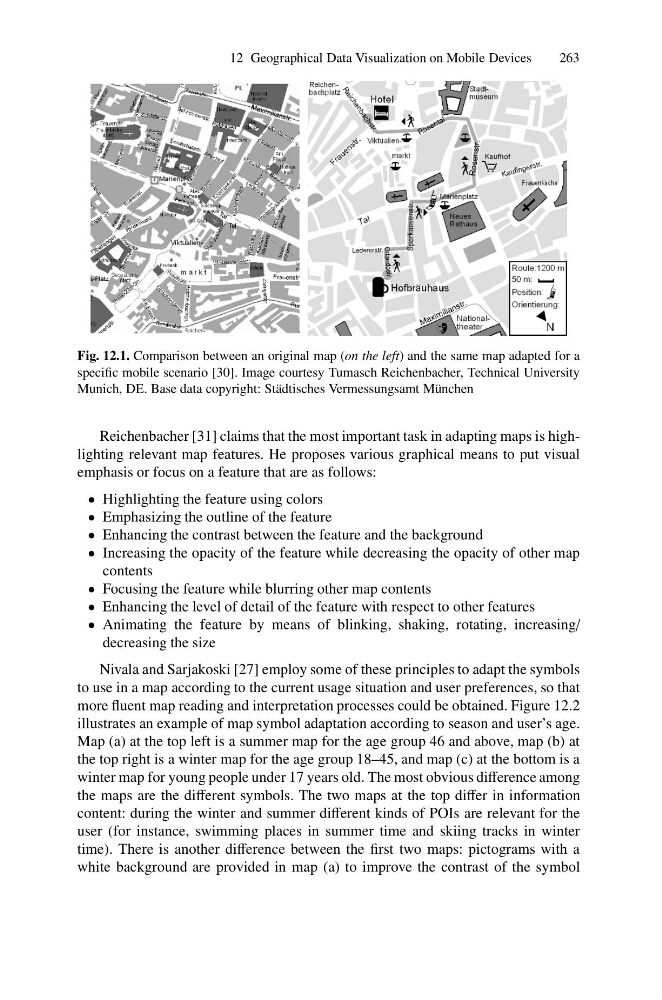
Fig. 12.1. Comparison between an original map (on the left) and the same map adapted for a
specific mobile scenario [30]. Image courtesy Tumasch Reichenbacher, Technical University
Munich, DE. Base data copyright: St¨ adtisches Vermessungsamt M¨ unchen
Reichenbacher [31] claims that the most important task in adapting maps is highlighting relevant map features. He proposes various graphical means to put visual
emphasis or focus on a feature that are as follows:
• Highlighting the feature using colors
• Emphasizing the outline of the feature
• Enhancing the contrast between the feature and the background
• Increasing the opacity of the feature while decreasing the opacity of other map
contents
• Focusing the feature while blurring other map contents
• Enhancing the level of detail of the feature with respect to other features
• Animating the feature by means of blinking, shaking, rotating, increasing/
decreasing the size
Nivala and Sarjakoski [27] employ some of these principles to adapt the symbols
to use in a map according to the current usage situation and user preferences, so that
more fluent map reading and interpretation processes could be obtained. Figure 12.2
illustrates an example of map symbol adaptation according to season and user’s age.
Map (a) at the top left is a summer map for the age group 46 and above, map (b) at
the top right is a winter map for the age group 18–45, and map (c) at the bottom is a
winter map for young people under 17 years old. The most obvious difference among
the maps are the different symbols. The two maps at the top differ in information
content: during the winter and summer different kinds of POIs are relevant for the
user (for instance, swimming places in summer time and skiing tracks in winter
time). There is another difference between the first two maps: pictograms with a
white background are provided in map (a) to improve the contrast of the symbol
263
Fig. 12.1. Comparison between an original map (on the left) and the same map adapted for a
specific mobile scenario [30]. Image courtesy Tumasch Reichenbacher, Technical University
Munich, DE. Base data copyright: St¨ adtisches Vermessungsamt M¨ unchen
Reichenbacher [31] claims that the most important task in adapting maps is highlighting relevant map features. He proposes various graphical means to put visual
emphasis or focus on a feature that are as follows:
• Highlighting the feature using colors
• Emphasizing the outline of the feature
• Enhancing the contrast between the feature and the background
• Increasing the opacity of the feature while decreasing the opacity of other map
contents
• Focusing the feature while blurring other map contents
• Enhancing the level of detail of the feature with respect to other features
• Animating the feature by means of blinking, shaking, rotating, increasing/
decreasing the size
Nivala and Sarjakoski [27] employ some of these principles to adapt the symbols
to use in a map according to the current usage situation and user preferences, so that
more fluent map reading and interpretation processes could be obtained. Figure 12.2
illustrates an example of map symbol adaptation according to season and user’s age.
Map (a) at the top left is a summer map for the age group 46 and above, map (b) at
the top right is a winter map for the age group 18–45, and map (c) at the bottom is a
winter map for young people under 17 years old. The most obvious difference among
the maps are the different symbols. The two maps at the top differ in information
content: during the winter and summer different kinds of POIs are relevant for the
user (for instance, swimming places in summer time and skiing tracks in winter
time). There is another difference between the first two maps: pictograms with a
white background are provided in map (a) to improve the contrast of the symbol