

## Graphical display of association matrices
# Colour plots (also called heat maps, or trellis diagrams in the
# data analysis literature) using the coldiss() function
# Usage:
# coldiss(D = dissimilarity.matrix,
#
nc = 4,
#
byrank = TRUE,
#
diag = FALSE)
# If D is not a dissimilarity matrix (max(D) > 1), then D is
# divided by max(D)
# nc number of colours (classes)
# byrank = TRUE
equal-sized classes
# byrank = FALSE
equal-length intervals
# diag = TRUE
print object labels also on the diagonal
## Compare dissimilarity and distance matrices obtained from the
## species data. Four colours are used with equal-length intervals
# Percentage difference (aka Bray-Curtis) dissimilarity matrix on
# raw species abundance data
coldiss(spe.db, byrank = FALSE, diag = TRUE)
# Same but on log-transformed data
coldiss(spe.dbln, byrank = FALSE, diag = TRUE)
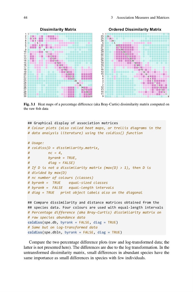
Compare the two percentage difference plots (raw and log-transformed data; the
latter is not presented here). The differences are due to the log transformation. In the
untransformed dissimilarity matrix, small differences in abundant species have the
same importance as small differences in species with few individuals.
Dissimilarity Matrix
30
29
28
27
26
25
24
23
22
21
20
19
18
17
16
15
14
13
12
11
10
9
7
6
5
4
3
2
1 1
2
3
4
5
6
7
9
10
11
12
13
14
15
16
17
18
19
20
21
22
23
24
25
26
27
28
29
30
Ordered Dissimilarity Matrix
9
11
14
13
12
2
7
3
4
6
15
10
16
17
18
19
26
20
21
22
29
28
27
30
5
24
25
23
1 1
23
25
24
5
30
27
28
29
22
21
20
26
19
18
17
16
10
15
6
4
3
7
2
12
13
14
11
9
Fig. 3.1 Heat maps of a percentage difference (aka Bray-Curtis) dissimilarity matrix computed on
the raw fish data
44
3 Association Measures and Matrices
# Colour plots (also called heat maps, or trellis diagrams in the
# data analysis literature) using the coldiss() function
# Usage:
# coldiss(D = dissimilarity.matrix,
#
nc = 4,
#
byrank = TRUE,
#
diag = FALSE)
# If D is not a dissimilarity matrix (max(D) > 1), then D is
# divided by max(D)
# nc number of colours (classes)
# byrank = TRUE
equal-sized classes
# byrank = FALSE
equal-length intervals
# diag = TRUE
print object labels also on the diagonal
## Compare dissimilarity and distance matrices obtained from the
## species data. Four colours are used with equal-length intervals
# Percentage difference (aka Bray-Curtis) dissimilarity matrix on
# raw species abundance data
coldiss(spe.db, byrank = FALSE, diag = TRUE)
# Same but on log-transformed data
coldiss(spe.dbln, byrank = FALSE, diag = TRUE)
Compare the two percentage difference plots (raw and log-transformed data; the
latter is not presented here). The differences are due to the log transformation. In the
untransformed dissimilarity matrix, small differences in abundant species have the
same importance as small differences in species with few individuals.
Dissimilarity Matrix
30
29
28
27
26
25
24
23
22
21
20
19
18
17
16
15
14
13
12
11
10
9
7
6
5
4
3
2
1 1
2
3
4
5
6
7
9
10
11
12
13
14
15
16
17
18
19
20
21
22
23
24
25
26
27
28
29
30
Ordered Dissimilarity Matrix
9
11
14
13
12
2
7
3
4
6
15
10
16
17
18
19
26
20
21
22
29
28
27
30
5
24
25
23
1 1
23
25
24
5
30
27
28
29
22
21
20
26
19
18
17
16
10
15
6
4
3
7
2
12
13
14
11
9
Fig. 3.1 Heat maps of a percentage difference (aka Bray-Curtis) dissimilarity matrix computed on
the raw fish data
44
3 Association Measures and Matrices