

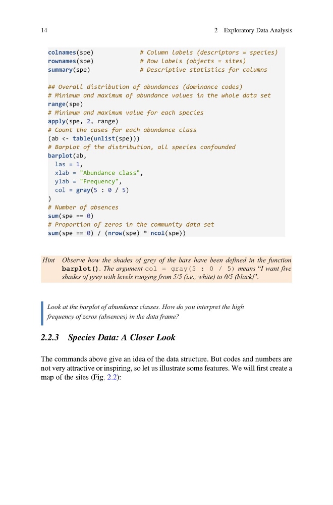
colnames(spe)
# Column labels (descriptors = species)
rownames(spe)
# Row labels (objects = sites)
summary(spe)
# Descriptive statistics for columns
## Overall distribution of abundances (dominance codes)
# Minimum and maximum of abundance values in the whole data set
range(spe)
# Minimum and maximum value for each species
apply(spe, 2, range)
# Count the cases for each abundance class
(ab <- table(unlist(spe)))
# Barplot of the distribution, all species confounded
barplot(ab,
las = 1,
xlab = "Abundance class",
ylab = "Frequency",
col = gray(5 : 0 / 5)
)
# Number of absences
sum(spe == 0)
# Proportion of zeros in the community data set
sum(spe == 0) / (nrow(spe) * ncol(spe))
Hint Observe how the shades of grey of the bars have been defined in the function
barplot(). The argument col = gray(5 : 0 / 5) means “I want five
shades of grey with levels ranging from 5/5 (i.e., white) to 0/5 (black)”.
Look at the barplot of abundance classes. How do you interpret the high
frequency of zeros (absences) in the data frame?
2.2.3 Species Data: A Closer Look
The commands above give an idea of the data structure. But codes and numbers are
not very attractive or inspiring, so let us illustrate some features. We will first create a
map of the sites (Fig. 2.2):
14
2 Exploratory Data Analysis
# Column labels (descriptors = species)
rownames(spe)
# Row labels (objects = sites)
summary(spe)
# Descriptive statistics for columns
## Overall distribution of abundances (dominance codes)
# Minimum and maximum of abundance values in the whole data set
range(spe)
# Minimum and maximum value for each species
apply(spe, 2, range)
# Count the cases for each abundance class
(ab <- table(unlist(spe)))
# Barplot of the distribution, all species confounded
barplot(ab,
las = 1,
xlab = "Abundance class",
ylab = "Frequency",
col = gray(5 : 0 / 5)
)
# Number of absences
sum(spe == 0)
# Proportion of zeros in the community data set
sum(spe == 0) / (nrow(spe) * ncol(spe))
Hint Observe how the shades of grey of the bars have been defined in the function
barplot(). The argument col = gray(5 : 0 / 5) means “I want five
shades of grey with levels ranging from 5/5 (i.e., white) to 0/5 (black)”.
Look at the barplot of abundance classes. How do you interpret the high
frequency of zeros (absences) in the data frame?
2.2.3 Species Data: A Closer Look
The commands above give an idea of the data structure. But codes and numbers are
not very attractive or inspiring, so let us illustrate some features. We will first create a
map of the sites (Fig. 2.2):
14
2 Exploratory Data Analysis