

children. Natural colors use green, brown, and yellow, which represent natural colors and represent
the forest where primates live in Agam District, used as a setting in for the story. Simultaneously,
bold colors use red, which reflects a child’s character in a pop-up book story.
Typography
The book’s typeface uses Berlin Sans FB. This typeface is bold, so it gives the impression of
a massive and concentrated space (Sihombing 2017). Therefore, bold letters are better suited for
short words like titles. The book content uses seven Soft Sans serif typefaces. This font is easy to
read for children.
Figure 1. Berlin Sans FB Demi (left) and Soft Sans Serif 7 (right). (Source: www.fontoteka.com,
www.1001freefonts.com).
Illustration style
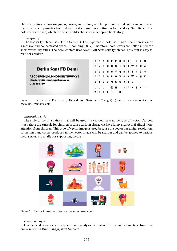
The style of the illustrations that will be used is a cartoon style in the type of vector. Cartoon
illustrations are suitable for children because cartoon characters have funny shapes that attract more
attention from children. This type of vector image is used because the vector has a high resolution,
so the lines and colors produced in the vector image will be sharper and can be applied to various
media sizes, especially for supporting media.
Figure 2. Vector illustration. (Source: www.gumroad.com).
Character style
Character design uses references and analysis of native forms and characters from the
environment in Bukit Tinggi, West Sumatra.
308
the forest where primates live in Agam District, used as a setting in for the story. Simultaneously,
bold colors use red, which reflects a child’s character in a pop-up book story.
Typography
The book’s typeface uses Berlin Sans FB. This typeface is bold, so it gives the impression of
a massive and concentrated space (Sihombing 2017). Therefore, bold letters are better suited for
short words like titles. The book content uses seven Soft Sans serif typefaces. This font is easy to
read for children.
Figure 1. Berlin Sans FB Demi (left) and Soft Sans Serif 7 (right). (Source: www.fontoteka.com,
www.1001freefonts.com).
Illustration style
The style of the illustrations that will be used is a cartoon style in the type of vector. Cartoon
illustrations are suitable for children because cartoon characters have funny shapes that attract more
attention from children. This type of vector image is used because the vector has a high resolution,
so the lines and colors produced in the vector image will be sharper and can be applied to various
media sizes, especially for supporting media.
Figure 2. Vector illustration. (Source: www.gumroad.com).
Character style
Character design uses references and analysis of native forms and characters from the
environment in Bukit Tinggi, West Sumatra.
308