

(in comparison with the case of Ukraine). Probably due to the fact that global
dynamics are influenced by many more different factors (as we saw in Chap. 7), the
situation in different countries and regions is very different.
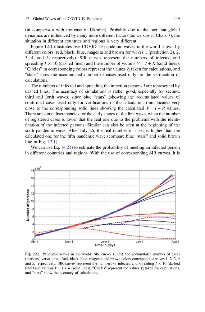
Figure 12.1 illustrates five COVID-19 pandemic waves in the world shown by
different colors (red, black, blue, magenta and brown for waves 1 (prediction 2), 2,
3, 4, and 5, respectively). SIR curves represent the numbers of infected and
spreading I Â 10 (dashed lines) and the number of victims V = I + R (solid lines).
“Circles” in corresponding colors represent the values V j taken for calculations, and
“stars” show the accumulated number of cases used only for the verification of
calculations.
The numbers of infected and spreading the infection persons I are represented by
dashed lines. The accuracy of simulations is rather good, especially for second,
third and forth waves, since blue “stars” (showing the accumulated values of
confirmed cases used only for verifications of the calculations) are located very
close to the corresponding solid lines showing the calculated V = I + R values.
There are some discrepancies for the early stages of the first wave, when the number
of registered cases is lower that the real one due to the problems with the identification of the infected persons. Similar can also be seen at the beginning of the
sixth pandemic wave. After July 26, the real number of cases is higher than the
calculated one for the fifth pandemic wave (compare blue “stars” and solid brown
line in Fig. 12.1).
We can use Eq. (4.21) to estimate the probability of meeting an infected person
in different countries and regions. With the use of corresponding SIR curves, it is
Fig. 12.1 Pandemic waves in the world. SIR curves (lines) and accumulated number of cases
(markers) versus time. Red, black, blue, magenta and brown colors correspond to waves 1, 2, 3, 4
and 5, respectively. SIR curves represent the numbers of infected and spreading I Â 10 (dashed
lines) and victims V = I + R (solid lines). “Circles” represent the values V j taken for calculations,
and “stars” show the accuracy of calculations
12 Global Waves of the COVID-19 Pandemic
149
dynamics are influenced by many more different factors (as we saw in Chap. 7), the
situation in different countries and regions is very different.
Figure 12.1 illustrates five COVID-19 pandemic waves in the world shown by
different colors (red, black, blue, magenta and brown for waves 1 (prediction 2), 2,
3, 4, and 5, respectively). SIR curves represent the numbers of infected and
spreading I Â 10 (dashed lines) and the number of victims V = I + R (solid lines).
“Circles” in corresponding colors represent the values V j taken for calculations, and
“stars” show the accumulated number of cases used only for the verification of
calculations.
The numbers of infected and spreading the infection persons I are represented by
dashed lines. The accuracy of simulations is rather good, especially for second,
third and forth waves, since blue “stars” (showing the accumulated values of
confirmed cases used only for verifications of the calculations) are located very
close to the corresponding solid lines showing the calculated V = I + R values.
There are some discrepancies for the early stages of the first wave, when the number
of registered cases is lower that the real one due to the problems with the identification of the infected persons. Similar can also be seen at the beginning of the
sixth pandemic wave. After July 26, the real number of cases is higher than the
calculated one for the fifth pandemic wave (compare blue “stars” and solid brown
line in Fig. 12.1).
We can use Eq. (4.21) to estimate the probability of meeting an infected person
in different countries and regions. With the use of corresponding SIR curves, it is
Fig. 12.1 Pandemic waves in the world. SIR curves (lines) and accumulated number of cases
(markers) versus time. Red, black, blue, magenta and brown colors correspond to waves 1, 2, 3, 4
and 5, respectively. SIR curves represent the numbers of infected and spreading I Â 10 (dashed
lines) and victims V = I + R (solid lines). “Circles” represent the values V j taken for calculations,
and “stars” show the accuracy of calculations
12 Global Waves of the COVID-19 Pandemic
149