

292
D. Irawan and B. Naujoks
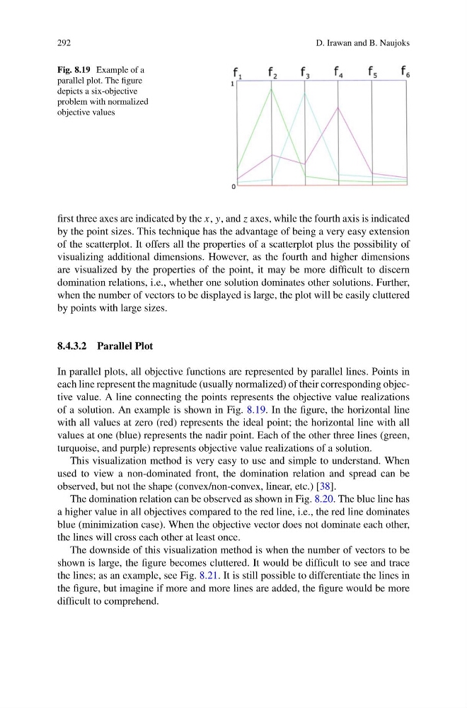
Fig. 8.19 Example of a
parallel plot. The figure
depicts a six-objective
problem with normalized
objective values
first three axes are indicated by the x, y, and z axes, while the fourth axis is indicated
by the point sizes. This technique has the advantage of being a very easy extension
of the scatterplot. It offers all the properties of a scatterplot plus the possibility of
visualizing additional dimensions. However, as the fourth and higher dimensions
are visualized by the properties of the point, it may be more difficult to discern
domination relations, i.e., whether one solution dominates other solutions. Further,
when the number of vectors to be displayed is large, the plot will be easily cluttered
by points with large sizes.
8.4.3.2 Parallel Plot
In parallel plots, all objective functions are represented by parallel lines. Points in
each line represent the magnitude (usually normalized) of their corresponding objective value. A line connecting the points represents the objective value realizations
of a solution. An example is shown in Fig. 8.19. In the figure, the horizontal line
with all values at zero (red) represents the ideal point; the horizontal line with all
values at one (blue) represents the nadir point. Each of the other three lines (green,
turquoise, and purple) represents objective value realizations of a solution.
This visualization method is very easy to use and simple to understand. When
used to view a non-dominated front, the domination relation and spread can be
observed, but not the shape (convex/non-convex, linear, etc.) [38].
The domination relation can be observed as shown in Fig. 8.20. The blue line has
a higher value in all objectives compared to the red line, i.e., the red line dominates
blue (minimization case). When the objective vector does not dominate each other,
the lines will cross each other at least once.
The downside of this visualization method is when the number of vectors to be
shown is large, the figure becomes cluttered. It would be difficult to see and trace
the lines; as an example, see Fig. 8.21. It is still possible to differentiate the lines in
the figure, but imagine if more and more lines are added, the figure would be more
difficult to comprehend.
D. Irawan and B. Naujoks
Fig. 8.19 Example of a
parallel plot. The figure
depicts a six-objective
problem with normalized
objective values
first three axes are indicated by the x, y, and z axes, while the fourth axis is indicated
by the point sizes. This technique has the advantage of being a very easy extension
of the scatterplot. It offers all the properties of a scatterplot plus the possibility of
visualizing additional dimensions. However, as the fourth and higher dimensions
are visualized by the properties of the point, it may be more difficult to discern
domination relations, i.e., whether one solution dominates other solutions. Further,
when the number of vectors to be displayed is large, the plot will be easily cluttered
by points with large sizes.
8.4.3.2 Parallel Plot
In parallel plots, all objective functions are represented by parallel lines. Points in
each line represent the magnitude (usually normalized) of their corresponding objective value. A line connecting the points represents the objective value realizations
of a solution. An example is shown in Fig. 8.19. In the figure, the horizontal line
with all values at zero (red) represents the ideal point; the horizontal line with all
values at one (blue) represents the nadir point. Each of the other three lines (green,
turquoise, and purple) represents objective value realizations of a solution.
This visualization method is very easy to use and simple to understand. When
used to view a non-dominated front, the domination relation and spread can be
observed, but not the shape (convex/non-convex, linear, etc.) [38].
The domination relation can be observed as shown in Fig. 8.20. The blue line has
a higher value in all objectives compared to the red line, i.e., the red line dominates
blue (minimization case). When the objective vector does not dominate each other,
the lines will cross each other at least once.
The downside of this visualization method is when the number of vectors to be
shown is large, the figure becomes cluttered. It would be difficult to see and trace
the lines; as an example, see Fig. 8.21. It is still possible to differentiate the lines in
the figure, but imagine if more and more lines are added, the figure would be more
difficult to comprehend.