

E1BAPPA 09/10/2010
11:31:17 Page 567
(c) If you are certain that y ¼ 0 when x ¼ 0, put the curve through the origin. But if you are uncertain,
don’t use the origin; stop the line at the lowest point (see 3b).
4. Use a minimum variety of symbols for your data. Always include a symbol legend. Consistently use the
same symbols for the same variables between graphs. Pick a symbol font that will be legible.
5. To compare experimentally determined data with model predictions, show the experimental points as
symbols and the model as a smooth curve. Similarly, show numerical predictions as a smooth curve.
Clear labeling is essential for this kind of plot.
6. The figure should contain enough information to stand alone, especially if there’s a chance it will later
be used by itself (e.g., as a slide).
7. Always provide axes quantities with units. Use axes font sizes that are readable.
8. Adjust the graph scales so that the curves are not bunched near the top, bottom, or one of the sides.
9. Uncertainty limits should be indicated for a number of measured points on a given plot using interval
bands about the mean value, as shown in Figure A.1
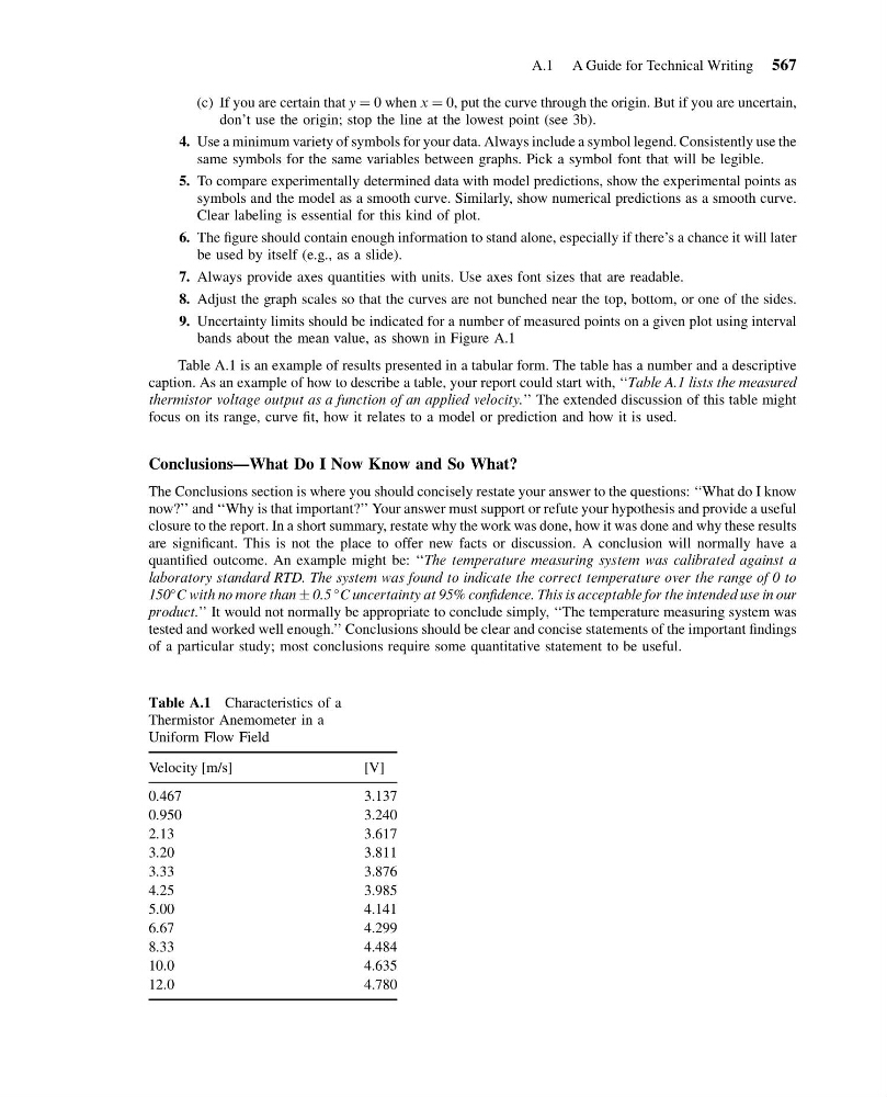
Table A.1 is an example of results presented in a tabular form. The table has a number and a descriptive
caption. As an example of how to describe a table, your report could start with, ‘‘Table A.1 lists the measured
thermistor voltage output as a function of an applied velocity.’’ The extended discussion of this table might
focus on its range, curve fit, how it relates to a model or prediction and how it is used.
Conclusions—What Do I Now Know and So What?
The Conclusions section is where you should concisely restate your answer to the questions: ‘‘What do I know
now?’’ and ‘‘Why is that important?’’ Your answer must support or refute your hypothesis and provide a useful
closure to the report. In a short summary, restate why the work was done, how it was done and why these results
are significant. This is not the place to offer new facts or discussion. A conclusion will normally have a
quantified outcome. An example might be: ‘‘The temperature measuring system was calibrated against a
laboratory standard RTD. The system was found to indicate the correct temperature over the range of 0 to
150
C with no more than Æ 0.5
C uncertainty at 95% confidence. This is acceptable for the intended use in our
product.’’ It would not normally be appropriate to conclude simply, ‘‘The temperature measuring system was
tested and worked well enough.’’ Conclusions should be clear and concise statements of the important findings
of a particular study; most conclusions require some quantitative statement to be useful.
Table A.1 Characteristics of a
Thermistor Anemometer in a
Uniform Flow Field
Velocity [m/s]
[V]
0.467
3.137
0.950
3.240
2.13
3.617
3.20
3.811
3.33
3.876
4.25
3.985
5.00
4.141
6.67
4.299
8.33
4.484
10.0
4.635
12.0
4.780
A.1 A Guide for Technical Writing 567
11:31:17 Page 567
(c) If you are certain that y ¼ 0 when x ¼ 0, put the curve through the origin. But if you are uncertain,
don’t use the origin; stop the line at the lowest point (see 3b).
4. Use a minimum variety of symbols for your data. Always include a symbol legend. Consistently use the
same symbols for the same variables between graphs. Pick a symbol font that will be legible.
5. To compare experimentally determined data with model predictions, show the experimental points as
symbols and the model as a smooth curve. Similarly, show numerical predictions as a smooth curve.
Clear labeling is essential for this kind of plot.
6. The figure should contain enough information to stand alone, especially if there’s a chance it will later
be used by itself (e.g., as a slide).
7. Always provide axes quantities with units. Use axes font sizes that are readable.
8. Adjust the graph scales so that the curves are not bunched near the top, bottom, or one of the sides.
9. Uncertainty limits should be indicated for a number of measured points on a given plot using interval
bands about the mean value, as shown in Figure A.1
Table A.1 is an example of results presented in a tabular form. The table has a number and a descriptive
caption. As an example of how to describe a table, your report could start with, ‘‘Table A.1 lists the measured
thermistor voltage output as a function of an applied velocity.’’ The extended discussion of this table might
focus on its range, curve fit, how it relates to a model or prediction and how it is used.
Conclusions—What Do I Now Know and So What?
The Conclusions section is where you should concisely restate your answer to the questions: ‘‘What do I know
now?’’ and ‘‘Why is that important?’’ Your answer must support or refute your hypothesis and provide a useful
closure to the report. In a short summary, restate why the work was done, how it was done and why these results
are significant. This is not the place to offer new facts or discussion. A conclusion will normally have a
quantified outcome. An example might be: ‘‘The temperature measuring system was calibrated against a
laboratory standard RTD. The system was found to indicate the correct temperature over the range of 0 to
150
C with no more than Æ 0.5
C uncertainty at 95% confidence. This is acceptable for the intended use in our
product.’’ It would not normally be appropriate to conclude simply, ‘‘The temperature measuring system was
tested and worked well enough.’’ Conclusions should be clear and concise statements of the important findings
of a particular study; most conclusions require some quantitative statement to be useful.
Table A.1 Characteristics of a
Thermistor Anemometer in a
Uniform Flow Field
Velocity [m/s]
[V]
0.467
3.137
0.950
3.240
2.13
3.617
3.20
3.811
3.33
3.876
4.25
3.985
5.00
4.141
6.67
4.299
8.33
4.484
10.0
4.635
12.0
4.780
A.1 A Guide for Technical Writing 567