

E1BAPPA 09/10/2010
11:31:17 Page 566
Data must be interpreted to be useful and this section is where you transform the raw data in your notes into
useful results within the report. For any experimental or numerical study, you should include a synopsis of your
uncertainty analysis culminating in a statement about the quality of the results presented. Often the most
important vehicles for the clear presentation of results are figures and tables. Each figure and table should be
numbered, labeled with a caption, and cited by number within the text. Since you have spent significant time in
preparing the plots and tables and you are intimately familiar with their trends and implications; the reader
needs your insight to understand the results as well as you. As a good rule, spend at least one paragraph
discussing each figure or table.
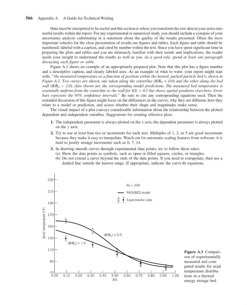
Figure A.1 shows an example of an appropriately prepared plot. Note that this plot has a figure number
and a descriptive caption, and clearly labeled axes. As an example of what to write: your report might start
with, ‘‘the measured temperature as a function of position within the heated, packed particle bed is shown in
Figure A.1. Two curves are shown, one taken along the centerline (R/R 0 ¼ 0.0) and the other along the bed
wall (R/R 0 ¼ 1.0). Also shown are the corresponding model predictions. The measured bed temperature is
essentially uniform from the centerline to the wall for X/L > 0.5 but shows spatial gradients elsewhere. Error
bars represent the 95% confidence intervals.’’ Be sure to cite any corresponding equations used. Then the
extended discussion of this figure might focus on the differences in the curves, why they are different, how they
relate to a model or prediction, and assess whether their shape and magnitudes make sense.
The visual impact of a plot conveys considerable information about the relationship between the plotted
dependent and independent variables. Suggestions for creating effective plots:
1. The independent parameter is always plotted on the x axis; the dependent parameter is always plotted
on the y axis.
2. Try to use at least four tics or increments for each axis. Multiples of 1, 2, or 5 are good increments
because they make it easy to interpolate. Watch out for automatic scaling features from software: it is
hard to justify strange increments such as 0, 7, 14.
3. In drawing smooth curves through experimental data points, try to follow these rules:
(a) Show the data points as symbols, such as open or filled squares, circles, or triangles.
(b) Do not extend a curve beyond the ends of the data points. If you need to extrapolate, then use a
dashed line outside the known range. If appropriate, indicate the curve-fit equations.
1.00
0.90
0.80
0.70
0.60
0.50
0.40
0.30
0.20
0.10
0.00
X/L
Solid temperature [°F]
70
90
110
130
(R/R 0 ) = 1.0
(R/R 0 ) = 0.0
150
170
190
Re = 200
PACKBED model
Experimental data
210
230
Figure A.1 Comparison of experimentally
measured and computed results for axial
temperature distributions in a thermal
energy storage bed.
566 Appendix A A Guide for Technical Writing
11:31:17 Page 566
Data must be interpreted to be useful and this section is where you transform the raw data in your notes into
useful results within the report. For any experimental or numerical study, you should include a synopsis of your
uncertainty analysis culminating in a statement about the quality of the results presented. Often the most
important vehicles for the clear presentation of results are figures and tables. Each figure and table should be
numbered, labeled with a caption, and cited by number within the text. Since you have spent significant time in
preparing the plots and tables and you are intimately familiar with their trends and implications; the reader
needs your insight to understand the results as well as you. As a good rule, spend at least one paragraph
discussing each figure or table.
Figure A.1 shows an example of an appropriately prepared plot. Note that this plot has a figure number
and a descriptive caption, and clearly labeled axes. As an example of what to write: your report might start
with, ‘‘the measured temperature as a function of position within the heated, packed particle bed is shown in
Figure A.1. Two curves are shown, one taken along the centerline (R/R 0 ¼ 0.0) and the other along the bed
wall (R/R 0 ¼ 1.0). Also shown are the corresponding model predictions. The measured bed temperature is
essentially uniform from the centerline to the wall for X/L > 0.5 but shows spatial gradients elsewhere. Error
bars represent the 95% confidence intervals.’’ Be sure to cite any corresponding equations used. Then the
extended discussion of this figure might focus on the differences in the curves, why they are different, how they
relate to a model or prediction, and assess whether their shape and magnitudes make sense.
The visual impact of a plot conveys considerable information about the relationship between the plotted
dependent and independent variables. Suggestions for creating effective plots:
1. The independent parameter is always plotted on the x axis; the dependent parameter is always plotted
on the y axis.
2. Try to use at least four tics or increments for each axis. Multiples of 1, 2, or 5 are good increments
because they make it easy to interpolate. Watch out for automatic scaling features from software: it is
hard to justify strange increments such as 0, 7, 14.
3. In drawing smooth curves through experimental data points, try to follow these rules:
(a) Show the data points as symbols, such as open or filled squares, circles, or triangles.
(b) Do not extend a curve beyond the ends of the data points. If you need to extrapolate, then use a
dashed line outside the known range. If appropriate, indicate the curve-fit equations.
1.00
0.90
0.80
0.70
0.60
0.50
0.40
0.30
0.20
0.10
0.00
X/L
Solid temperature [°F]
70
90
110
130
(R/R 0 ) = 1.0
(R/R 0 ) = 0.0
150
170
190
Re = 200
PACKBED model
Experimental data
210
230
Figure A.1 Comparison of experimentally
measured and computed results for axial
temperature distributions in a thermal
energy storage bed.
566 Appendix A A Guide for Technical Writing