

4.2 Correlation Analysis
This article uses a visual approach named parallel graphs and associated heat maps to
show the relationship between factors and target (gas emission).
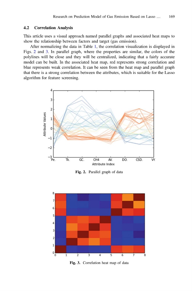
After normalizing the data in Table 1, the correlation visualization is displayed in
Figs. 2 and 3. In parallel graph, where the properties are similar, the colors of the
polylines will be close and they will be centralized, indicating that a fairly accurate
model can be built. In the associated heat map, red represents strong correlation and
blue represents weak correlation. It can be seen from the heat map and parallel graph
that there is a strong correlation between the attributes, which is suitable for the Lasso
algorithm for feature screening.
Fig. 2. Parallel graph of data
Fig. 3. Correlation heat map of data
Research on Prediction Model of Gas Emission Based on Lasso …
169
This article uses a visual approach named parallel graphs and associated heat maps to
show the relationship between factors and target (gas emission).
After normalizing the data in Table 1, the correlation visualization is displayed in
Figs. 2 and 3. In parallel graph, where the properties are similar, the colors of the
polylines will be close and they will be centralized, indicating that a fairly accurate
model can be built. In the associated heat map, red represents strong correlation and
blue represents weak correlation. It can be seen from the heat map and parallel graph
that there is a strong correlation between the attributes, which is suitable for the Lasso
algorithm for feature screening.
Fig. 2. Parallel graph of data
Fig. 3. Correlation heat map of data
Research on Prediction Model of Gas Emission Based on Lasso …
169