

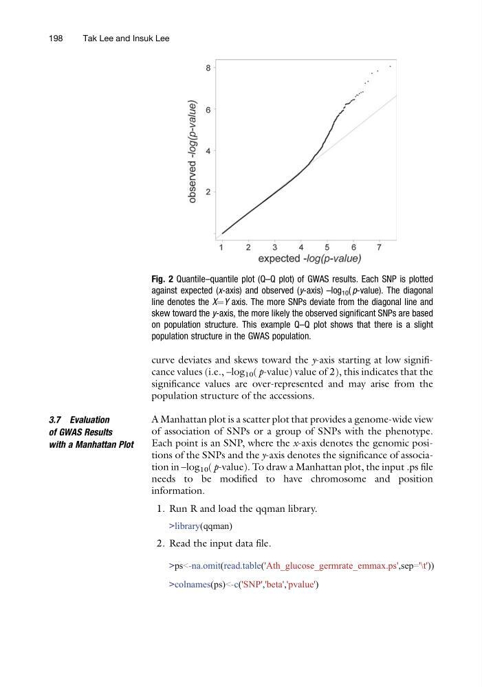
curve deviates and skews toward the y-axis starting at low significance values (i.e., –log 10 ( p-value) value of 2), this indicates that the
significance values are over-represented and may arise from the
population structure of the accessions.
3.7 Evaluation
of GWAS Results
with a Manhattan Plot
A Manhattan plot is a scatter plot that provides a genome-wide view
of association of SNPs or a group of SNPs with the phenotype.
Each point is an SNP, where the x-axis denotes the genomic positions of the SNPs and the y-axis denotes the significance of association in –log 10 ( p-value). To draw a Manhattan plot, the input .ps file
needs to be modified to have chromosome and position
information.
1. Run R and load the qqman library.
>library(qqman)
2. Read the input data file.
>ps<-na.omit(read.table('Ath_glucose_germrate_emmax.ps',sep='\t'))
>colnames(ps)<-c('SNP','beta','pvalue')
Fig. 2 Quantile–quantile plot (Q–Q plot) of GWAS results. Each SNP is plotted
against expected (x-axis) and observed (y-axis) –log 10 ( p-value). The diagonal
line denotes the X¼Y axis. The more SNPs deviate from the diagonal line and
skew toward the y-axis, the more likely the observed significant SNPs are based
on population structure. This example Q–Q plot shows that there is a slight
population structure in the GWAS population.
198
Tak Lee and Insuk Lee
significance values are over-represented and may arise from the
population structure of the accessions.
3.7 Evaluation
of GWAS Results
with a Manhattan Plot
A Manhattan plot is a scatter plot that provides a genome-wide view
of association of SNPs or a group of SNPs with the phenotype.
Each point is an SNP, where the x-axis denotes the genomic positions of the SNPs and the y-axis denotes the significance of association in –log 10 ( p-value). To draw a Manhattan plot, the input .ps file
needs to be modified to have chromosome and position
information.
1. Run R and load the qqman library.
>library(qqman)
2. Read the input data file.
>ps<-na.omit(read.table('Ath_glucose_germrate_emmax.ps',sep='\t'))
>colnames(ps)<-c('SNP','beta','pvalue')
Fig. 2 Quantile–quantile plot (Q–Q plot) of GWAS results. Each SNP is plotted
against expected (x-axis) and observed (y-axis) –log 10 ( p-value). The diagonal
line denotes the X¼Y axis. The more SNPs deviate from the diagonal line and
skew toward the y-axis, the more likely the observed significant SNPs are based
on population structure. This example Q–Q plot shows that there is a slight
population structure in the GWAS population.
198
Tak Lee and Insuk Lee