

The Evolution of the Water–Energy–Food Nexus …
55
Table 6 WEF nexus
composite indices for South
Africa
Indicator
Composite indices
2015
2018
Water availability
0.126
0.099
Water productivity
0.128
0.221
Energy accessibility
0.141
0.079
Energy productivity
0.111
0.199
Food self-sufficiency
0.314
0.292
Cereal productivity
0.180
0.111
WEF integrated index
0.155
0.203
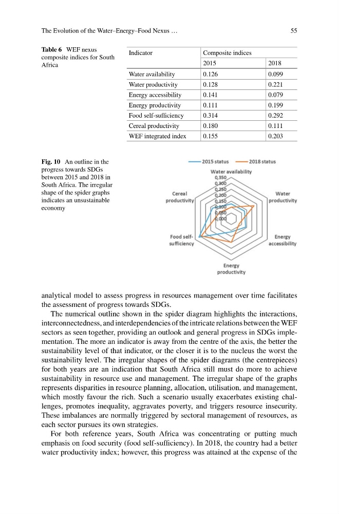
Fig. 10 An outline in the
progress towards SDGs
between 2015 and 2018 in
South Africa. The irregular
shape of the spider graphs
indicates an unsustainable
economy
analytical model to assess progress in resources management over time facilitates
the assessment of progress towards SDGs.
The numerical outline shown in the spider diagram highlights the interactions,
interconnectedness, and interdependencies of the intricate relations between the WEF
sectors as seen together, providing an outlook and general progress in SDGs implementation. The more an indicator is away from the centre of the axis, the better the
sustainability level of that indicator, or the closer it is to the nucleus the worst the
sustainability level. The irregular shapes of the spider diagrams (the centrepieces)
for both years are an indication that South Africa still must do more to achieve
sustainability in resource use and management. The irregular shape of the graphs
represents disparities in resource planning, allocation, utilisation, and management,
which mostly favour the rich. Such a scenario usually exacerbates existing challenges, promotes inequality, aggravates poverty, and triggers resource insecurity.
These imbalances are normally triggered by sectoral management of resources, as
each sector pursues its own strategies.
For both reference years, South Africa was concentrating or putting much
emphasis on food security (food self-sufficiency). In 2018, the country had a better
water productivity index; however, this progress was attained at the expense of the
55
Table 6 WEF nexus
composite indices for South
Africa
Indicator
Composite indices
2015
2018
Water availability
0.126
0.099
Water productivity
0.128
0.221
Energy accessibility
0.141
0.079
Energy productivity
0.111
0.199
Food self-sufficiency
0.314
0.292
Cereal productivity
0.180
0.111
WEF integrated index
0.155
0.203
Fig. 10 An outline in the
progress towards SDGs
between 2015 and 2018 in
South Africa. The irregular
shape of the spider graphs
indicates an unsustainable
economy
analytical model to assess progress in resources management over time facilitates
the assessment of progress towards SDGs.
The numerical outline shown in the spider diagram highlights the interactions,
interconnectedness, and interdependencies of the intricate relations between the WEF
sectors as seen together, providing an outlook and general progress in SDGs implementation. The more an indicator is away from the centre of the axis, the better the
sustainability level of that indicator, or the closer it is to the nucleus the worst the
sustainability level. The irregular shapes of the spider diagrams (the centrepieces)
for both years are an indication that South Africa still must do more to achieve
sustainability in resource use and management. The irregular shape of the graphs
represents disparities in resource planning, allocation, utilisation, and management,
which mostly favour the rich. Such a scenario usually exacerbates existing challenges, promotes inequality, aggravates poverty, and triggers resource insecurity.
These imbalances are normally triggered by sectoral management of resources, as
each sector pursues its own strategies.
For both reference years, South Africa was concentrating or putting much
emphasis on food security (food self-sufficiency). In 2018, the country had a better
water productivity index; however, this progress was attained at the expense of the