

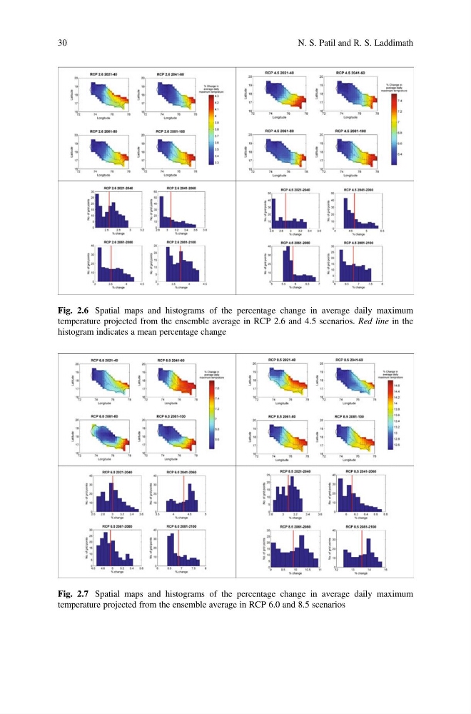
Fig. 2.6 Spatial maps and histograms of the percentage change in average daily maximum
temperature projected from the ensemble average in RCP 2.6 and 4.5 scenarios. Red line in the
histogram indicates a mean percentage change
Fig. 2.7 Spatial maps and histograms of the percentage change in average daily maximum
temperature projected from the ensemble average in RCP 6.0 and 8.5 scenarios
30
N. S. Patil and R. S. Laddimath
temperature projected from the ensemble average in RCP 2.6 and 4.5 scenarios. Red line in the
histogram indicates a mean percentage change
Fig. 2.7 Spatial maps and histograms of the percentage change in average daily maximum
temperature projected from the ensemble average in RCP 6.0 and 8.5 scenarios
30
N. S. Patil and R. S. Laddimath