

128
14.3 Also Good for Reports
This book has emphasized numerous times the need to adapt graphs and tables from
reports (scientific, financial or others) for the purpose of a presentation. What is
acceptable for a report, is not necessarily acceptable for an on-screen live presentation. Specifically, data points and fonts must be large enough, graphs must be clean
and include only the required information, and colors must help to distinguish the
different data sets.
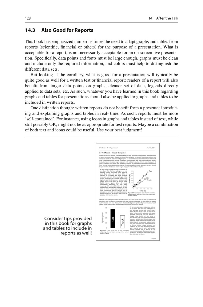
But looking at the corollary, what is good for a presentation will typically be
quite good as well for a written test or financial report: readers of a report will also
benefit from larger data points on graphs, cleaner set of data, legends directly
applied to data sets, etc. As such, whatever you have learned in this book regarding
graphs and tables for presentations should also be applied to graphs and tables to be
included in written reports.
One distinction though: written reports do not benefit from a presenter introducing and explaining graphs and tables in real- time. As such, reports must be more
‘self-contained’. For instance, using icons in graphs and tables instead of text, while
still possibly OK, might not be as appropriate for test reports. Maybe a combination
of both text and icons could be useful. Use your best judgment!
14 After the Talk
14.3 Also Good for Reports
This book has emphasized numerous times the need to adapt graphs and tables from
reports (scientific, financial or others) for the purpose of a presentation. What is
acceptable for a report, is not necessarily acceptable for an on-screen live presentation. Specifically, data points and fonts must be large enough, graphs must be clean
and include only the required information, and colors must help to distinguish the
different data sets.
But looking at the corollary, what is good for a presentation will typically be
quite good as well for a written test or financial report: readers of a report will also
benefit from larger data points on graphs, cleaner set of data, legends directly
applied to data sets, etc. As such, whatever you have learned in this book regarding
graphs and tables for presentations should also be applied to graphs and tables to be
included in written reports.
One distinction though: written reports do not benefit from a presenter introducing and explaining graphs and tables in real- time. As such, reports must be more
‘self-contained’. For instance, using icons in graphs and tables instead of text, while
still possibly OK, might not be as appropriate for test reports. Maybe a combination
of both text and icons could be useful. Use your best judgment!
14 After the Talk