

NO x emissions by 10% in 2015 relative to emissions in 2011. Several studies
showed that OMI NO 2 levels increased from 2005 to 2011 followed by a slight
decrease (Krotkov et al. 2016; Duncan et al. 2016). Reduction of NO x emissions
originating from China after 2011–2012 was confirmed based on satellite data by
various researches (e.g., Miyazaki et al. 2017; Souri et al. 2017; Van der A et al.
2017). Latest estimations showed that NO x emission decreased by ~20% during the
2010–2017 period (see Fig. 2.1 in Chap. 2). However, taking a 10-year period
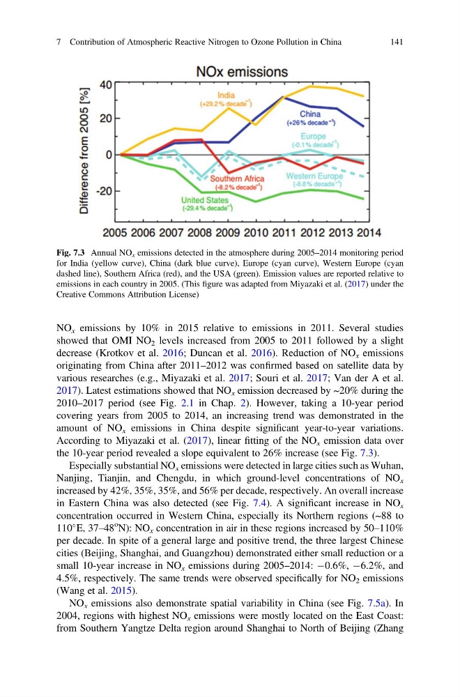
covering years from 2005 to 2014, an increasing trend was demonstrated in the
amount of NO x emissions in China despite significant year-to-year variations.
According to Miyazaki et al. (2017), linear fitting of the NO x emission data over
the 10-year period revealed a slope equivalent to 26% increase (see Fig. 7.3).
Especially substantial NO x emissions were detected in large cities such as Wuhan,
Nanjing, Tianjin, and Chengdu, in which ground-level concentrations of NO x
increased by 42%, 35%, 35%, and 56% per decade, respectively. An overall increase
in Eastern China was also detected (see Fig. 7.4). A significant increase in NO x
concentration occurred in Western China, especially its Northern regions (~88 to
110
E, 37–48
o N): NO x concentration in air in these regions increased by 50–110%
per decade. In spite of a general large and positive trend, the three largest Chinese
cities (Beijing, Shanghai, and Guangzhou) demonstrated either small reduction or a
small 10-year increase in NO x emissions during 2005–2014: À0.6%, À6.2%, and
4.5%, respectively. The same trends were observed specifically for NO 2 emissions
(Wang et al. 2015).
NO x emissions also demonstrate spatial variability in China (see Fig. 7.5a). In
2004, regions with highest NO x emissions were mostly located on the East Coast:
from Southern Yangtze Delta region around Shanghai to North of Beijing (Zhang
Fig. 7.3 Annual NO x emissions detected in the atmosphere during 2005–2014 monitoring period
for India (yellow curve), China (dark blue curve), Europe (cyan curve), Western Europe (cyan
dashed line), Southern Africa (red), and the USA (green). Emission values are reported relative to
emissions in each country in 2005. (This figure was adapted from Miyazaki et al. (2017) under the
Creative Commons Attribution License)
7 Contribution of Atmospheric Reactive Nitrogen to Ozone Pollution in China
141
showed that OMI NO 2 levels increased from 2005 to 2011 followed by a slight
decrease (Krotkov et al. 2016; Duncan et al. 2016). Reduction of NO x emissions
originating from China after 2011–2012 was confirmed based on satellite data by
various researches (e.g., Miyazaki et al. 2017; Souri et al. 2017; Van der A et al.
2017). Latest estimations showed that NO x emission decreased by ~20% during the
2010–2017 period (see Fig. 2.1 in Chap. 2). However, taking a 10-year period
covering years from 2005 to 2014, an increasing trend was demonstrated in the
amount of NO x emissions in China despite significant year-to-year variations.
According to Miyazaki et al. (2017), linear fitting of the NO x emission data over
the 10-year period revealed a slope equivalent to 26% increase (see Fig. 7.3).
Especially substantial NO x emissions were detected in large cities such as Wuhan,
Nanjing, Tianjin, and Chengdu, in which ground-level concentrations of NO x
increased by 42%, 35%, 35%, and 56% per decade, respectively. An overall increase
in Eastern China was also detected (see Fig. 7.4). A significant increase in NO x
concentration occurred in Western China, especially its Northern regions (~88 to
110
E, 37–48
o N): NO x concentration in air in these regions increased by 50–110%
per decade. In spite of a general large and positive trend, the three largest Chinese
cities (Beijing, Shanghai, and Guangzhou) demonstrated either small reduction or a
small 10-year increase in NO x emissions during 2005–2014: À0.6%, À6.2%, and
4.5%, respectively. The same trends were observed specifically for NO 2 emissions
(Wang et al. 2015).
NO x emissions also demonstrate spatial variability in China (see Fig. 7.5a). In
2004, regions with highest NO x emissions were mostly located on the East Coast:
from Southern Yangtze Delta region around Shanghai to North of Beijing (Zhang
Fig. 7.3 Annual NO x emissions detected in the atmosphere during 2005–2014 monitoring period
for India (yellow curve), China (dark blue curve), Europe (cyan curve), Western Europe (cyan
dashed line), Southern Africa (red), and the USA (green). Emission values are reported relative to
emissions in each country in 2005. (This figure was adapted from Miyazaki et al. (2017) under the
Creative Commons Attribution License)
7 Contribution of Atmospheric Reactive Nitrogen to Ozone Pollution in China
141