

136
alternative combinations of goods an economy can produce showing how an expansion
of production of one good may cause contraction of production of another. The bold
black line in panels A and B gives a continuous set of energy-food production possibilities using different technologies. Each point on the curve represents a choice of
a technology or a particular resource allocation which results in a certain level of
food production (y-axis) and the corresponding level of energy production (x-axis).
Thus, lower energy production correlates to higher food production or vice-versa.
In panel A, the solid green line gives the ratio of the food price to the energy price
at a point in time. According to economic theory, the production technology chosen
will be the one where there is a tangency between the line giving the price ratio and
the production possibilities curve. This means production in our case will occur
where the green dashed line is tangent to the bold black line—at the green dot.
Now given this basic setup, consider panel B where we have a solid red line representing the highest observed ratio of food price to energy price in recent history,
and the blue solid line representing the lowest ratio again in recent times. Then, in
this case, the only Nexus technologies we have observed fall between the red and
blue dotted points and those outside will not have been seen. This means for example if the ratio of say ethanol to gasoline prices has been in one interval that we
would not have seen strategies appearing that allowed use of much more ethanol in
cars which would only happen if much lower relative prices appeared.
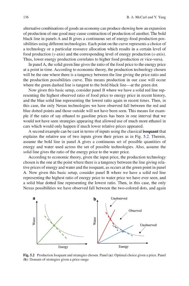
A second example can be cast in terms of inputs using the classical isoquant that
explains the relative use of two inputs given their prices as in Fig. 5.2. Therein,
assume the bold line in panel A gives a continuous set of possible quantities of
energy and water used across the set of possible technologies. Also, assume the
solid line gives the ratio of the energy price to the water price.
According to economic theory, given the input price, the production technology
chosen is the one at the point where there is a tangency between the line giving relative prices of energy and water and the isoquant, as occurs at the green point in panel
A. Now given this basic setup, consider panel B where we have a solid red line
representing the highest ratio of energy price to water price we have ever seen, and
a solid blue dotted line representing the lowest ratio. Then, in this case, the only
Nexus possibilities we have observed fall between the two-colored dots, and again
Fig. 5.2 Production Isoquant and strategies chosen. Panel (a): Optimal choice given a price. Panel
(b): Domain of strategies given a price range
B. A. McCarl and Y. Yang
alternative combinations of goods an economy can produce showing how an expansion
of production of one good may cause contraction of production of another. The bold
black line in panels A and B gives a continuous set of energy-food production possibilities using different technologies. Each point on the curve represents a choice of
a technology or a particular resource allocation which results in a certain level of
food production (y-axis) and the corresponding level of energy production (x-axis).
Thus, lower energy production correlates to higher food production or vice-versa.
In panel A, the solid green line gives the ratio of the food price to the energy price
at a point in time. According to economic theory, the production technology chosen
will be the one where there is a tangency between the line giving the price ratio and
the production possibilities curve. This means production in our case will occur
where the green dashed line is tangent to the bold black line—at the green dot.
Now given this basic setup, consider panel B where we have a solid red line representing the highest observed ratio of food price to energy price in recent history,
and the blue solid line representing the lowest ratio again in recent times. Then, in
this case, the only Nexus technologies we have observed fall between the red and
blue dotted points and those outside will not have been seen. This means for example if the ratio of say ethanol to gasoline prices has been in one interval that we
would not have seen strategies appearing that allowed use of much more ethanol in
cars which would only happen if much lower relative prices appeared.
A second example can be cast in terms of inputs using the classical isoquant that
explains the relative use of two inputs given their prices as in Fig. 5.2. Therein,
assume the bold line in panel A gives a continuous set of possible quantities of
energy and water used across the set of possible technologies. Also, assume the
solid line gives the ratio of the energy price to the water price.
According to economic theory, given the input price, the production technology
chosen is the one at the point where there is a tangency between the line giving relative prices of energy and water and the isoquant, as occurs at the green point in panel
A. Now given this basic setup, consider panel B where we have a solid red line
representing the highest ratio of energy price to water price we have ever seen, and
a solid blue dotted line representing the lowest ratio. Then, in this case, the only
Nexus possibilities we have observed fall between the two-colored dots, and again
Fig. 5.2 Production Isoquant and strategies chosen. Panel (a): Optimal choice given a price. Panel
(b): Domain of strategies given a price range
B. A. McCarl and Y. Yang