

5. When all peptides are processed and the Excel file complete, the
percentage of deuteration or the number of deuterons can be
easily calculated [2] and used for visualization of the results.
3.6 Data
Visualization
There are no set guidelines on how to visualize HDX data, and
indeed, a multitude of different plots are used throughout the
literature. The first result that is usually obtained is a set of uptake
plots in which the percentage of deuteration or the number of
deuterons is plotted for each peptide as a function of time. However, from such a display, it is difficult to interpret the data in the
structural context and also to efficiently handle the information
from overlapping peptides. For a more comprehensive view, heat
maps or protection plots [38] are most often utilized. These summarize the information into one picture and present it along the
protein sequence. However, their basic form does not allow one to
visualize information from the overlapping peptides as the data are
plotted using only a subset of selected (usually shortest) peptides
continuously covering the entire sequence. To also include the
redundancy information, peptide midpoints can be calculated
[29] for each peptide, which allows the distinction of closely related
ones (e.g., 14–25, 14–27, 16–25, 16–27). Upon this modification,
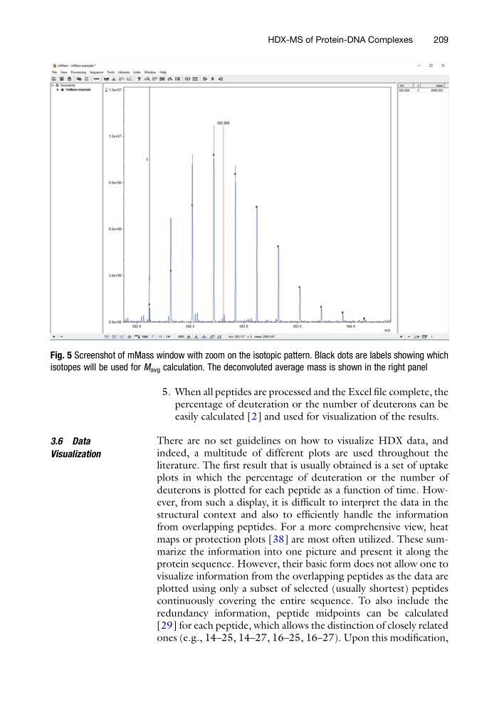
Fig. 5 Screenshot of mMass window with zoom on the isotopic pattern. Black dots are labels showing which
isotopes will be used for M avg calculation. The deconvoluted average mass is shown in the right panel
HDX-MS of Protein-DNA Complexes
209
percentage of deuteration or the number of deuterons can be
easily calculated [2] and used for visualization of the results.
3.6 Data
Visualization
There are no set guidelines on how to visualize HDX data, and
indeed, a multitude of different plots are used throughout the
literature. The first result that is usually obtained is a set of uptake
plots in which the percentage of deuteration or the number of
deuterons is plotted for each peptide as a function of time. However, from such a display, it is difficult to interpret the data in the
structural context and also to efficiently handle the information
from overlapping peptides. For a more comprehensive view, heat
maps or protection plots [38] are most often utilized. These summarize the information into one picture and present it along the
protein sequence. However, their basic form does not allow one to
visualize information from the overlapping peptides as the data are
plotted using only a subset of selected (usually shortest) peptides
continuously covering the entire sequence. To also include the
redundancy information, peptide midpoints can be calculated
[29] for each peptide, which allows the distinction of closely related
ones (e.g., 14–25, 14–27, 16–25, 16–27). Upon this modification,
Fig. 5 Screenshot of mMass window with zoom on the isotopic pattern. Black dots are labels showing which
isotopes will be used for M avg calculation. The deconvoluted average mass is shown in the right panel
HDX-MS of Protein-DNA Complexes
209