

65
foreigners for each census block was linked to the map by considering all groups as
evenly distributed on the surface covered by the footprint of residential buildings.
Noteworthy, overlapping of vulnerabilities (e.g. an old person that is also a foreigner) were not taken into account; instead, any vulnerable was counted as one unit
assuming that an individual that is both old and foreigner and the presence of one
old person and one foreigner would raise equally the vulnerability of the neighbourhood. The overall score of ES demand was obtained by normalizing the number of
vulnerable individuals in the sample areas on a scale between 0 and 10. The distribution of vulnerable individuals is almost proportional to the distribution of the
population density, i.e. the area with the highest population density is also the area
with highest number of vulnerable individuals.
6.3.4 Combining Information of Supply, Access and Demand
Taken singularly, the results of the analyses described in the previous sub-sections
can be used to identify hotspots in the city where supply, access and demand for ES
are particularly high. The supply, access and demand scores can also be aggregated
to unveil, for example, mismatches between demand and supply (Ortiz and Geneletti
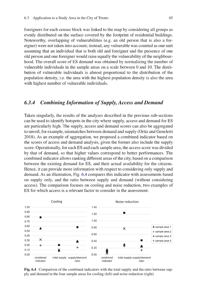
2018). As an example of aggregation, we proposed a combined indicator based on
the scores of access and demand analysis, given the former also include the supply
score. Operationally, for each ES and each sample area, the access score was divided
by that of demand, so that higher values correspond to better performances. The
combined indicator allows ranking different areas of the city, based on a comparison
between the existing demand for ES, and their actual availability for the citizens.
Hence, it can provide more information with respect to considering only supply and
demand. As an illustration, Fig. 6.4 compares this indicator with assessments based
on supply only, and the ratio between supply and demand (without considering
access). The comparison focuses on cooling and noise reduction, two examples of
ES for which access is a relevant factor to consider in the assessment.
0.00
0.10
0.20
0.30
0.40
0.50
0.60
0.70
0.80
0.90
1.00
combined
indicator
total supply supply/demand
ratio
Cooling
0.00
0.20
0.40
0.60
0.80
1.00
1.20
1.40
combined
indicator
total supply supply/demand
ratio
Noise reduction
sample area 1
sample area 2
sample area 3
sample area 4
Fig. 6.4 Comparison of the combined indicators with the total supply and the ratio between supply and demand in the four sample areas for cooling (left) and noise reduction (right)
6.3 Application to a Study Area in the City of Trento
foreigners for each census block was linked to the map by considering all groups as
evenly distributed on the surface covered by the footprint of residential buildings.
Noteworthy, overlapping of vulnerabilities (e.g. an old person that is also a foreigner) were not taken into account; instead, any vulnerable was counted as one unit
assuming that an individual that is both old and foreigner and the presence of one
old person and one foreigner would raise equally the vulnerability of the neighbourhood. The overall score of ES demand was obtained by normalizing the number of
vulnerable individuals in the sample areas on a scale between 0 and 10. The distribution of vulnerable individuals is almost proportional to the distribution of the
population density, i.e. the area with the highest population density is also the area
with highest number of vulnerable individuals.
6.3.4 Combining Information of Supply, Access and Demand
Taken singularly, the results of the analyses described in the previous sub-sections
can be used to identify hotspots in the city where supply, access and demand for ES
are particularly high. The supply, access and demand scores can also be aggregated
to unveil, for example, mismatches between demand and supply (Ortiz and Geneletti
2018). As an example of aggregation, we proposed a combined indicator based on
the scores of access and demand analysis, given the former also include the supply
score. Operationally, for each ES and each sample area, the access score was divided
by that of demand, so that higher values correspond to better performances. The
combined indicator allows ranking different areas of the city, based on a comparison
between the existing demand for ES, and their actual availability for the citizens.
Hence, it can provide more information with respect to considering only supply and
demand. As an illustration, Fig. 6.4 compares this indicator with assessments based
on supply only, and the ratio between supply and demand (without considering
access). The comparison focuses on cooling and noise reduction, two examples of
ES for which access is a relevant factor to consider in the assessment.
0.00
0.10
0.20
0.30
0.40
0.50
0.60
0.70
0.80
0.90
1.00
combined
indicator
total supply supply/demand
ratio
Cooling
0.00
0.20
0.40
0.60
0.80
1.00
1.20
1.40
combined
indicator
total supply supply/demand
ratio
Noise reduction
sample area 1
sample area 2
sample area 3
sample area 4
Fig. 6.4 Comparison of the combined indicators with the total supply and the ratio between supply and demand in the four sample areas for cooling (left) and noise reduction (right)
6.3 Application to a Study Area in the City of Trento