

12
C. M. García-Witulski and M. J. Rabassa
a
b
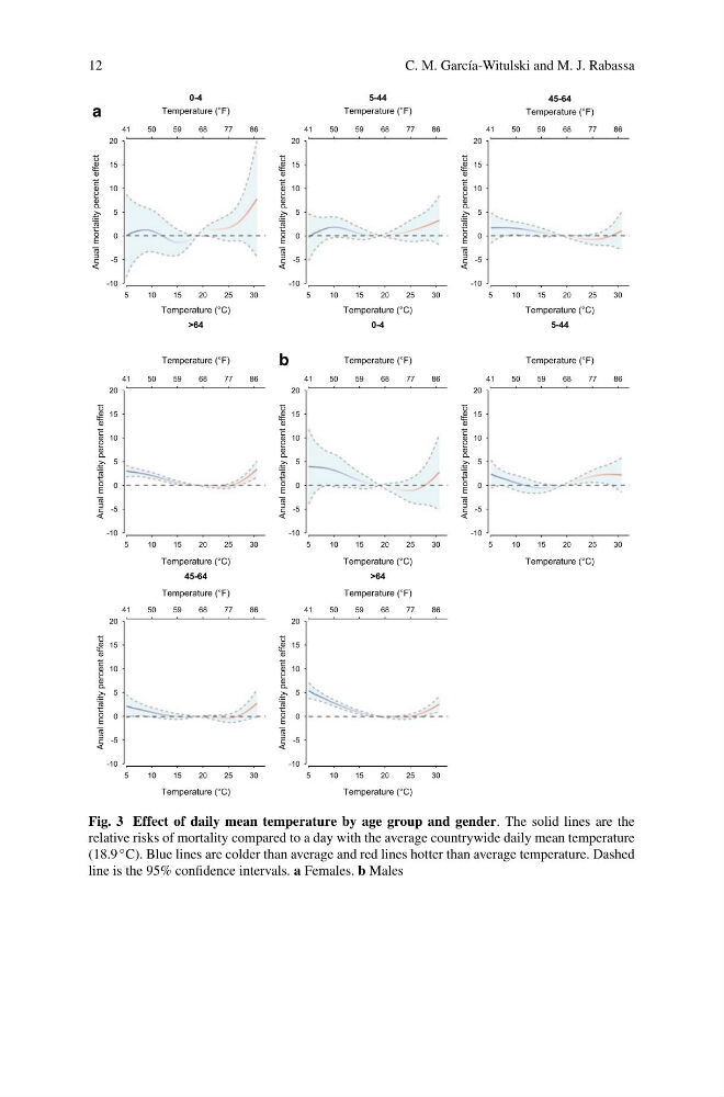
Fig. 3 Effect of daily mean temperature by age group and gender. The solid lines are the
relative risks of mortality compared to a day with the average countrywide daily mean temperature
(18.9 ◦ C). Blue lines are colder than average and red lines hotter than average temperature. Dashed
line is the 95% confidence intervals. a Females. b Males
C. M. García-Witulski and M. J. Rabassa
a
b
Fig. 3 Effect of daily mean temperature by age group and gender. The solid lines are the
relative risks of mortality compared to a day with the average countrywide daily mean temperature
(18.9 ◦ C). Blue lines are colder than average and red lines hotter than average temperature. Dashed
line is the 95% confidence intervals. a Females. b Males