

10 How the World Began
209
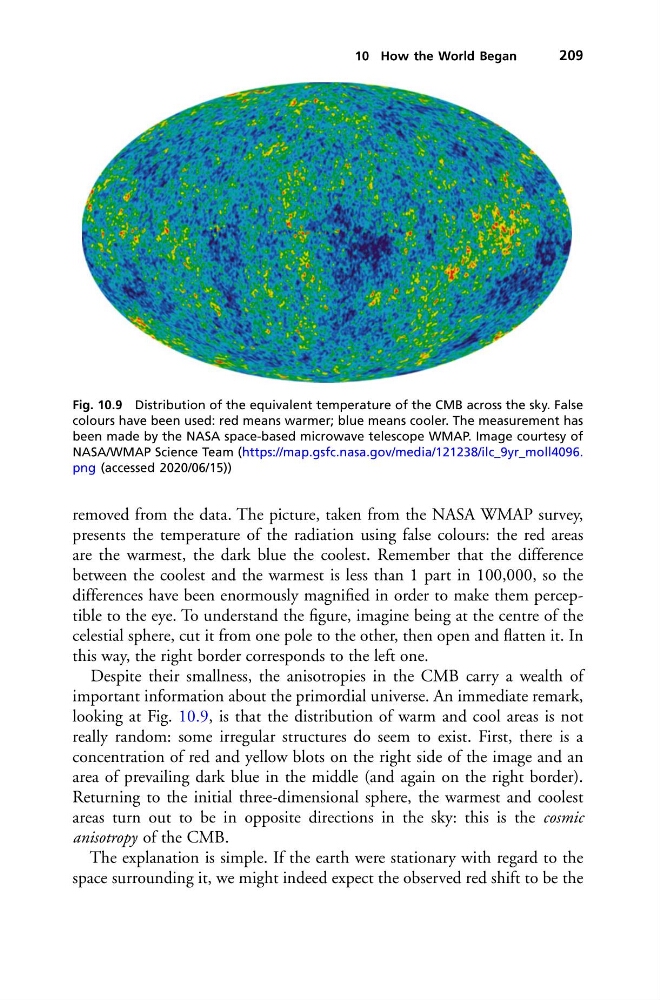
Fig. 10.9 Distribution of the equivalent temperature of the CMB across the sky. False
colours have been used: red means warmer; blue means cooler. The measurement has
been made by the NASA space-based microwave telescope WMAP. Image courtesy of
NASA/WMAP Science Team (https://map.gsfc.nasa.gov/media/121238/ilc_9yr_moll4096.
png (accessed 2020/06/15))
removed from the data. The picture, taken from the NASA WMAP survey,
presents the temperature of the radiation using false colours: the red areas
are the warmest, the dark blue the coolest. Remember that the difference
between the coolest and the warmest is less than 1 part in 100,000, so the
differences have been enormously magnified in order to make them perceptible to the eye. To understand the figure, imagine being at the centre of the
celestial sphere, cut it from one pole to the other, then open and flatten it. In
this way, the right border corresponds to the left one.
Despite their smallness, the anisotropies in the CMB carry a wealth of
important information about the primordial universe. An immediate remark,
looking at Fig. 10.9, is that the distribution of warm and cool areas is not
really random: some irregular structures do seem to exist. First, there is a
concentration of red and yellow blots on the right side of the image and an
area of prevailing dark blue in the middle (and again on the right border).
Returning to the initial three-dimensional sphere, the warmest and coolest
areas turn out to be in opposite directions in the sky: this is the cosmic
anisotropy of the CMB.
The explanation is simple. If the earth were stationary with regard to the
space surrounding it, we might indeed expect the observed red shift to be the
209
Fig. 10.9 Distribution of the equivalent temperature of the CMB across the sky. False
colours have been used: red means warmer; blue means cooler. The measurement has
been made by the NASA space-based microwave telescope WMAP. Image courtesy of
NASA/WMAP Science Team (https://map.gsfc.nasa.gov/media/121238/ilc_9yr_moll4096.
png (accessed 2020/06/15))
removed from the data. The picture, taken from the NASA WMAP survey,
presents the temperature of the radiation using false colours: the red areas
are the warmest, the dark blue the coolest. Remember that the difference
between the coolest and the warmest is less than 1 part in 100,000, so the
differences have been enormously magnified in order to make them perceptible to the eye. To understand the figure, imagine being at the centre of the
celestial sphere, cut it from one pole to the other, then open and flatten it. In
this way, the right border corresponds to the left one.
Despite their smallness, the anisotropies in the CMB carry a wealth of
important information about the primordial universe. An immediate remark,
looking at Fig. 10.9, is that the distribution of warm and cool areas is not
really random: some irregular structures do seem to exist. First, there is a
concentration of red and yellow blots on the right side of the image and an
area of prevailing dark blue in the middle (and again on the right border).
Returning to the initial three-dimensional sphere, the warmest and coolest
areas turn out to be in opposite directions in the sky: this is the cosmic
anisotropy of the CMB.
The explanation is simple. If the earth were stationary with regard to the
space surrounding it, we might indeed expect the observed red shift to be the