

341
Nonetheless, we emphasize that these issues not only affect vision
but also psychophysical responses on the part of humans. Designers ultimately affect many of these responses via their manipulations of the qualities of light and its surrounds. Designers who are
knowledgeable about the way humans perceive and respond to
light and the luminous environment can make positive contributions here. After all, many basic connections between the qualities
of lighting and human well-being, comfort, or task performance
have been studied for years. Whether humans experience seasonal
affective disorders or not, for example, has long been linked to the
nature of surrounding lighting environments. Typical responses,
such as the use of full spectrum lighting, are known to all. What is
different now are the many rapid responses made in the neurological world in relation to vision, and—of particular interest here—
significant increases in our abilities to control the qualities of light
itself and the way it interacts with its surroundings. Recent advances
in understanding the way light affects the human circadian system
that in turn regulates other psychophysical responses, for example,
promise to suggest means for improving the design of interior environments via the use of specific kinds of light-emitting technologies coupled with particular material properties in the surrounding
surfaces that are all set within carefully designed configurations. All
these factors would affect the kinds of light perceived by occupants
and thus could affect their psychophysical responses. Well-known
experiments by George Brainard, et al., into the effects of “blue
light” on circadian rhythms suggest how an architectural ensemble
of light, space, and materials could be used to positive effect here.
In an everyday setting, designers invariably work with issues of
perception. Surfaces that appear different to those of surrounding surfaces are invariably a point of interest and intervention. The
appearance of a surface changes as a surrounding surface becomes
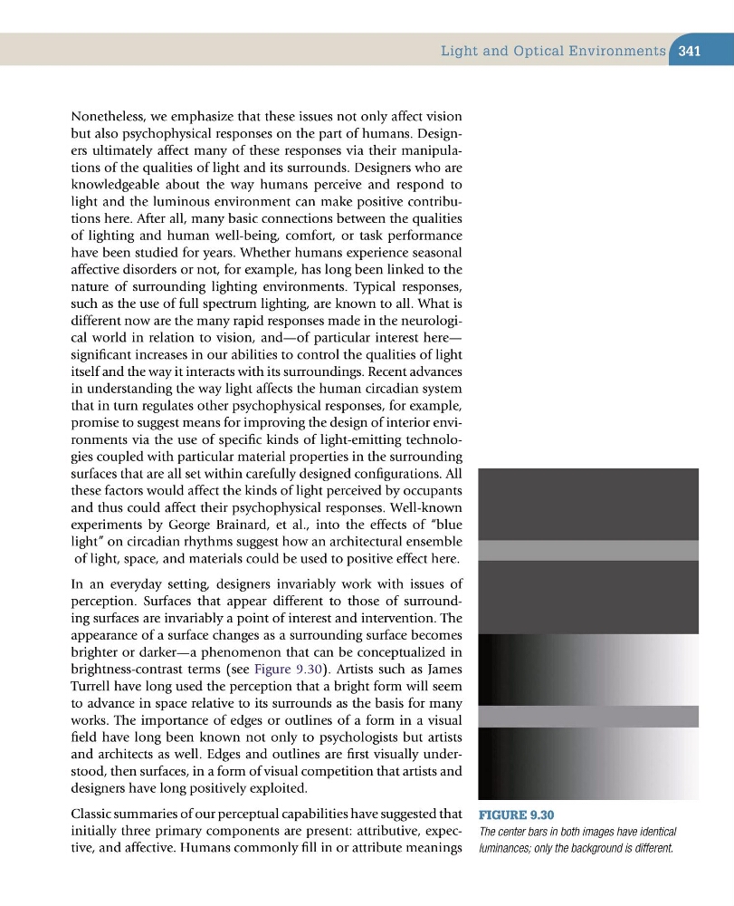
brighter or darker—a phenomenon that can be conceptualized in
brightness-contrast terms (see Figure 9.30). Artists such as James
Turrell have long used the perception that a bright form will seem
to advance in space relative to its surrounds as the basis for many
works. The importance of edges or outlines of a form in a visual
field have long been known not only to psychologists but artists
and architects as well. Edges and outlines are first visually understood, then surfaces, in a form of visual competition that artists and
designers have long positively exploited.
Classic summaries of our perceptual capabilities have suggested that
initially three primary components are present: attributive, expective, and affective. Humans commonly fill in or attribute meanings
Figure 9.30
The center bars in both images have identical
luminances; only the background is different.
Light and Optical Environments
Nonetheless, we emphasize that these issues not only affect vision
but also psychophysical responses on the part of humans. Designers ultimately affect many of these responses via their manipulations of the qualities of light and its surrounds. Designers who are
knowledgeable about the way humans perceive and respond to
light and the luminous environment can make positive contributions here. After all, many basic connections between the qualities
of lighting and human well-being, comfort, or task performance
have been studied for years. Whether humans experience seasonal
affective disorders or not, for example, has long been linked to the
nature of surrounding lighting environments. Typical responses,
such as the use of full spectrum lighting, are known to all. What is
different now are the many rapid responses made in the neurological world in relation to vision, and—of particular interest here—
significant increases in our abilities to control the qualities of light
itself and the way it interacts with its surroundings. Recent advances
in understanding the way light affects the human circadian system
that in turn regulates other psychophysical responses, for example,
promise to suggest means for improving the design of interior environments via the use of specific kinds of light-emitting technologies coupled with particular material properties in the surrounding
surfaces that are all set within carefully designed configurations. All
these factors would affect the kinds of light perceived by occupants
and thus could affect their psychophysical responses. Well-known
experiments by George Brainard, et al., into the effects of “blue
light” on circadian rhythms suggest how an architectural ensemble
of light, space, and materials could be used to positive effect here.
In an everyday setting, designers invariably work with issues of
perception. Surfaces that appear different to those of surrounding surfaces are invariably a point of interest and intervention. The
appearance of a surface changes as a surrounding surface becomes
brighter or darker—a phenomenon that can be conceptualized in
brightness-contrast terms (see Figure 9.30). Artists such as James
Turrell have long used the perception that a bright form will seem
to advance in space relative to its surrounds as the basis for many
works. The importance of edges or outlines of a form in a visual
field have long been known not only to psychologists but artists
and architects as well. Edges and outlines are first visually understood, then surfaces, in a form of visual competition that artists and
designers have long positively exploited.
Classic summaries of our perceptual capabilities have suggested that
initially three primary components are present: attributive, expective, and affective. Humans commonly fill in or attribute meanings
Figure 9.30
The center bars in both images have identical
luminances; only the background is different.
Light and Optical Environments