

530 Higher Engineering Mathematics
(c) The time that a battery lasts is measured and can
have any value between certain limits. Hence these
data are continuous.
(d) The amount of money spent on food can only be
expressed correct to the nearest pence, the amount
being counted. Hence, these data are discrete.
Now try the following exercise
Exercise 204 Further problems on discrete
and continuous data
In Problems 1 and 2, state whether data relating to
the topics given are discrete or continuous.
1. (a) The amount of petrol produced daily, for
each of 31 days, by a refinery.
(b) The amount of coal produced daily by
each of 15 miners.
(c) The number of bottles of milk delivered
daily by each of 20 milkmen.
(d) The size of 10 samples of rivets produced
by a machine.
(a) continuous (b) continuous
(c) discrete
(d) continuous
2. (a) The number of people visiting an exhibition on each of 5 days.
(b) The time taken by each of 12 athletes to
run 100 metres.
(c) The value of stamps sold in a day by
each of 20 post offices.
(d) The number of defective items produced in each of 10 one-hour periods
by a machine.
(a) discrete (b) continuous
(c) discrete (d) discrete
54.2 Presentation of ungrouped data
Ungrouped data can be presented diagrammatically in
several ways and these include:
(a) pictograms, in which pictorial symbols are used
to represent quantities (see Problem 2),
(b) horizontal bar charts, having data represented
by equally spaced horizontal rectangles (see Problem 3), and
(c) vertical bar charts, in which data are represented by equally spaced vertical rectangles (see
Problem 4).
Trends in ungrouped data over equal periods of time
can be presented diagrammatically by a percentage
component bar chart. In such a chart, equally spaced
rectangles of any width, but whose height corresponds
to 100%, are constructed. The rectangles are then subdivided into values corresponding to the percentage
relative frequencies of the members (see Problem 5).
A pie diagram is used to show diagrammatically the
parts making up the whole. In a pie diagram, the area of
a circle represents the whole, and the areas of the sectors
of the circle are made proportional to the parts which
make up the whole (see Problem 6).
Problem 2. The number of television sets
repaired in a workshop by a technician in six,
one-month periods is as shown below. Present these
data as a pictogram.
Month
Number repaired
January
11
February
6
March
15
April
9
May
13
June
8
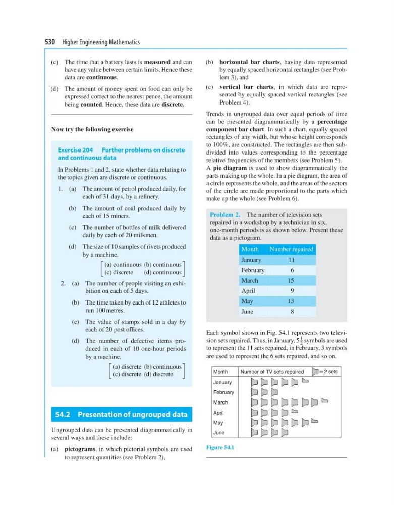
Each symbol shown in Fig. 54.1 represents two television sets repaired. Thus, in January, 5
1
2 symbols are used
to represent the 11 sets repaired, in February, 3 symbols
are used to represent the 6 sets repaired, and so on.
January
February
March
Month
Number of TV sets repaired
; 2 sets
April
May
June
Figure 54.1
(c) The time that a battery lasts is measured and can
have any value between certain limits. Hence these
data are continuous.
(d) The amount of money spent on food can only be
expressed correct to the nearest pence, the amount
being counted. Hence, these data are discrete.
Now try the following exercise
Exercise 204 Further problems on discrete
and continuous data
In Problems 1 and 2, state whether data relating to
the topics given are discrete or continuous.
1. (a) The amount of petrol produced daily, for
each of 31 days, by a refinery.
(b) The amount of coal produced daily by
each of 15 miners.
(c) The number of bottles of milk delivered
daily by each of 20 milkmen.
(d) The size of 10 samples of rivets produced
by a machine.
(a) continuous (b) continuous
(c) discrete
(d) continuous
2. (a) The number of people visiting an exhibition on each of 5 days.
(b) The time taken by each of 12 athletes to
run 100 metres.
(c) The value of stamps sold in a day by
each of 20 post offices.
(d) The number of defective items produced in each of 10 one-hour periods
by a machine.
(a) discrete (b) continuous
(c) discrete (d) discrete
54.2 Presentation of ungrouped data
Ungrouped data can be presented diagrammatically in
several ways and these include:
(a) pictograms, in which pictorial symbols are used
to represent quantities (see Problem 2),
(b) horizontal bar charts, having data represented
by equally spaced horizontal rectangles (see Problem 3), and
(c) vertical bar charts, in which data are represented by equally spaced vertical rectangles (see
Problem 4).
Trends in ungrouped data over equal periods of time
can be presented diagrammatically by a percentage
component bar chart. In such a chart, equally spaced
rectangles of any width, but whose height corresponds
to 100%, are constructed. The rectangles are then subdivided into values corresponding to the percentage
relative frequencies of the members (see Problem 5).
A pie diagram is used to show diagrammatically the
parts making up the whole. In a pie diagram, the area of
a circle represents the whole, and the areas of the sectors
of the circle are made proportional to the parts which
make up the whole (see Problem 6).
Problem 2. The number of television sets
repaired in a workshop by a technician in six,
one-month periods is as shown below. Present these
data as a pictogram.
Month
Number repaired
January
11
February
6
March
15
April
9
May
13
June
8
Each symbol shown in Fig. 54.1 represents two television sets repaired. Thus, in January, 5
1
2 symbols are used
to represent the 11 sets repaired, in February, 3 symbols
are used to represent the 6 sets repaired, and so on.
January
February
March
Month
Number of TV sets repaired
; 2 sets
April
May
June
Figure 54.1