

54
6.9
Beware When Zooming Bar Charts
Graphs are a great way to quickly convey quantitative information. However, in
some cases, they might introduce unwanted confusion. For instance, if you compare
categories of data in a bar chart, showing values between let’s say 425 and 550, it is
not appropriate to “zoom” the graph to have the vertical axis start anywhere other
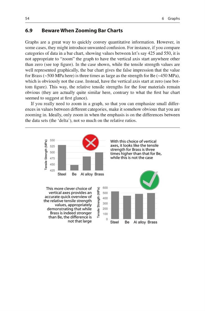
than zero (see top figure). In the case shown, while the tensile strength values are
well represented graphically, the bar chart gives the false impression that the value
for Brass (~500 MPa here) is three times as large as the strength for Be (~450 MPa),
which is obviously not the case. Instead, have the vertical axis start at zero (see bottom figure). This way, the relative tensile strengths for the four materials remain
obvious (they are actually quite similar here, contrary to what the first bar chart
seemed to suggest at first glance).
If you really need to zoom in a graph, so that you can emphasize small differences in values between different categories, make it somehow obvious that you are
zooming in. Ideally, only zoom in when the emphasis is on the differences between
the data sets (the ‘delta’), not so much on the relative ratios.
6 Graphs
6.9
Beware When Zooming Bar Charts
Graphs are a great way to quickly convey quantitative information. However, in
some cases, they might introduce unwanted confusion. For instance, if you compare
categories of data in a bar chart, showing values between let’s say 425 and 550, it is
not appropriate to “zoom” the graph to have the vertical axis start anywhere other
than zero (see top figure). In the case shown, while the tensile strength values are
well represented graphically, the bar chart gives the false impression that the value
for Brass (~500 MPa here) is three times as large as the strength for Be (~450 MPa),
which is obviously not the case. Instead, have the vertical axis start at zero (see bottom figure). This way, the relative tensile strengths for the four materials remain
obvious (they are actually quite similar here, contrary to what the first bar chart
seemed to suggest at first glance).
If you really need to zoom in a graph, so that you can emphasize small differences in values between different categories, make it somehow obvious that you are
zooming in. Ideally, only zoom in when the emphasis is on the differences between
the data sets (the ‘delta’), not so much on the relative ratios.
6 Graphs