

8
2.3
Stick to the Same Fonts
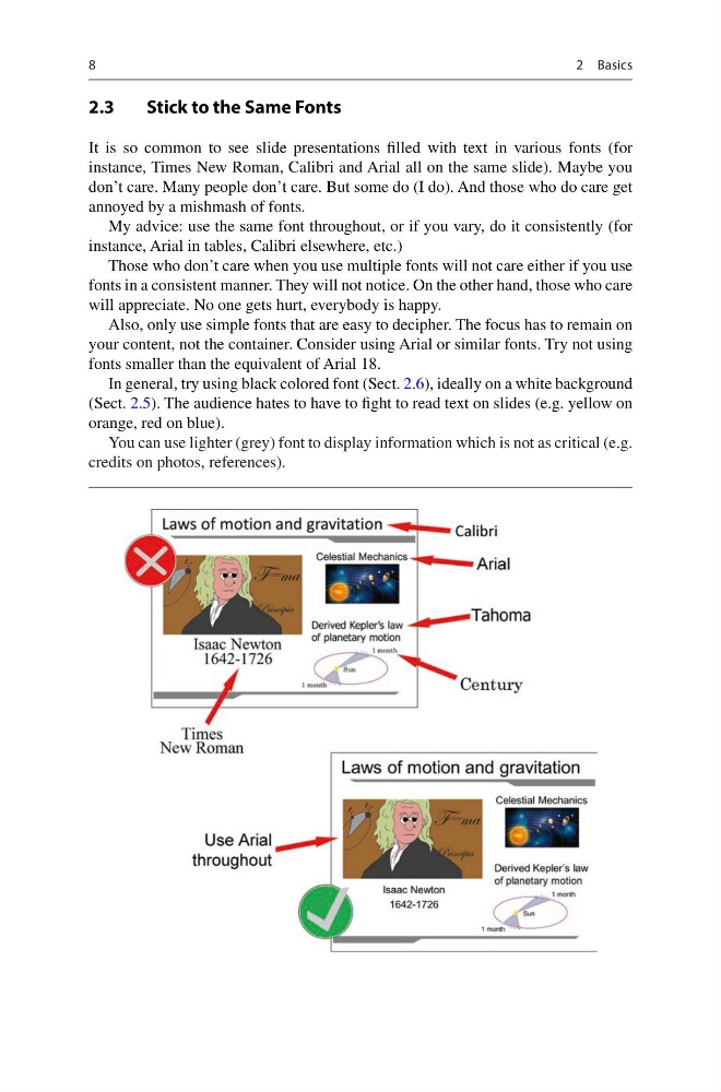
It is so common to see slide presentations filled with text in various fonts (for
instance, Times New Roman, Calibri and Arial all on the same slide). Maybe you
don’t care. Many people don’t care. But some do (I do). And those who do care get
annoyed by a mishmash of fonts.
My advice: use the same font throughout, or if you vary, do it consistently (for
instance, Arial in tables, Calibri elsewhere, etc.)
Those who don’t care when you use multiple fonts will not care either if you use
fonts in a consistent manner. They will not notice. On the other hand, those who care
will appreciate. No one gets hurt, everybody is happy.
Also, only use simple fonts that are easy to decipher. The focus has to remain on
your content, not the container. Consider using Arial or similar fonts. Try not using
fonts smaller than the equivalent of Arial 18.
In general, try using black colored font (Sect. 2.6), ideally on a white background
(Sect. 2.5). The audience hates to have to fight to read text on slides (e.g. yellow on
orange, red on blue).
You can use lighter (grey) font to display information which is not as critical (e.g.
credits on photos, references).
2 Basics
2.3
Stick to the Same Fonts
It is so common to see slide presentations filled with text in various fonts (for
instance, Times New Roman, Calibri and Arial all on the same slide). Maybe you
don’t care. Many people don’t care. But some do (I do). And those who do care get
annoyed by a mishmash of fonts.
My advice: use the same font throughout, or if you vary, do it consistently (for
instance, Arial in tables, Calibri elsewhere, etc.)
Those who don’t care when you use multiple fonts will not care either if you use
fonts in a consistent manner. They will not notice. On the other hand, those who care
will appreciate. No one gets hurt, everybody is happy.
Also, only use simple fonts that are easy to decipher. The focus has to remain on
your content, not the container. Consider using Arial or similar fonts. Try not using
fonts smaller than the equivalent of Arial 18.
In general, try using black colored font (Sect. 2.6), ideally on a white background
(Sect. 2.5). The audience hates to have to fight to read text on slides (e.g. yellow on
orange, red on blue).
You can use lighter (grey) font to display information which is not as critical (e.g.
credits on photos, references).
2 Basics